


Reel Styling Wednesday | Week 1
Reel Styling Wednesday | Week 1
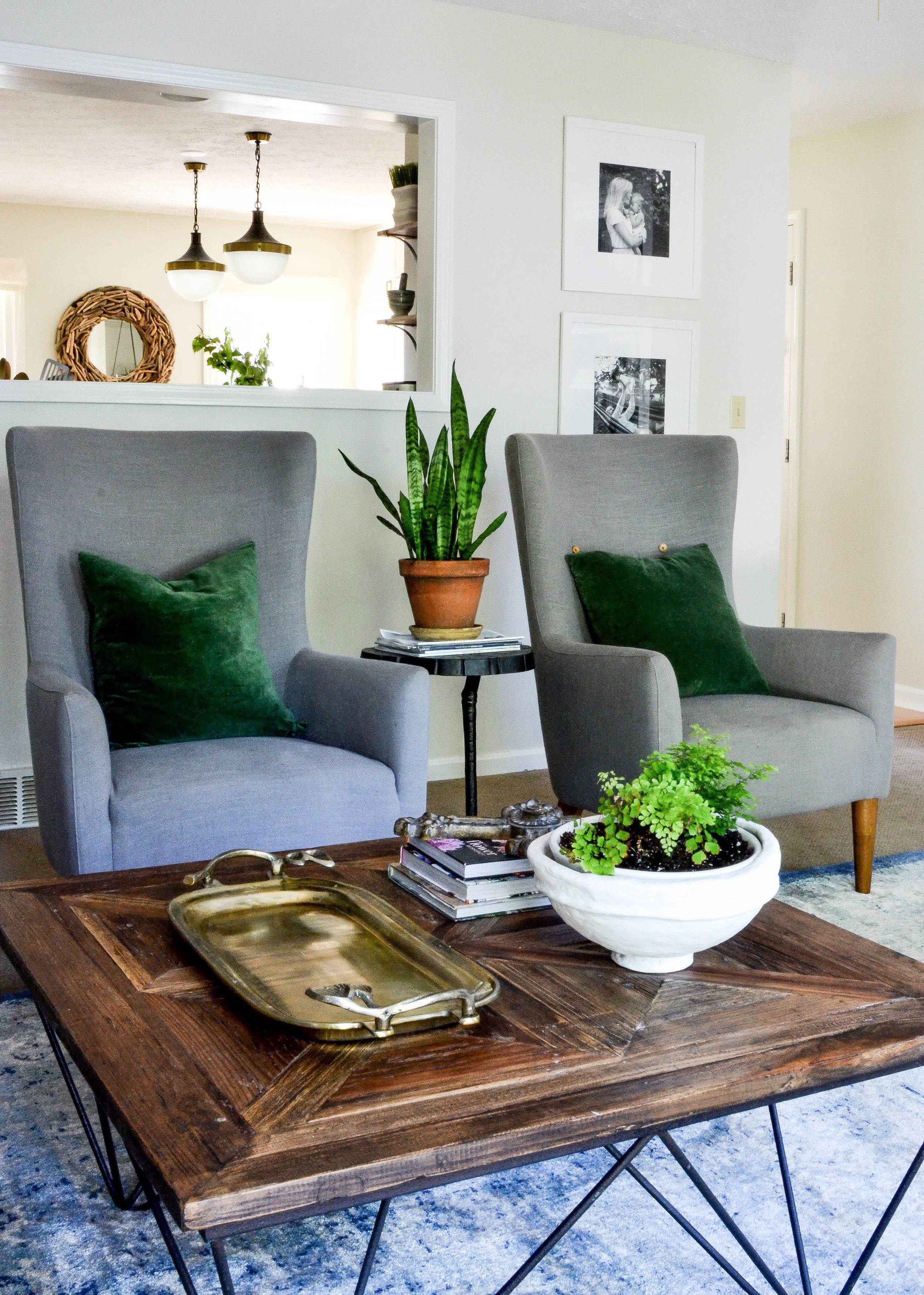
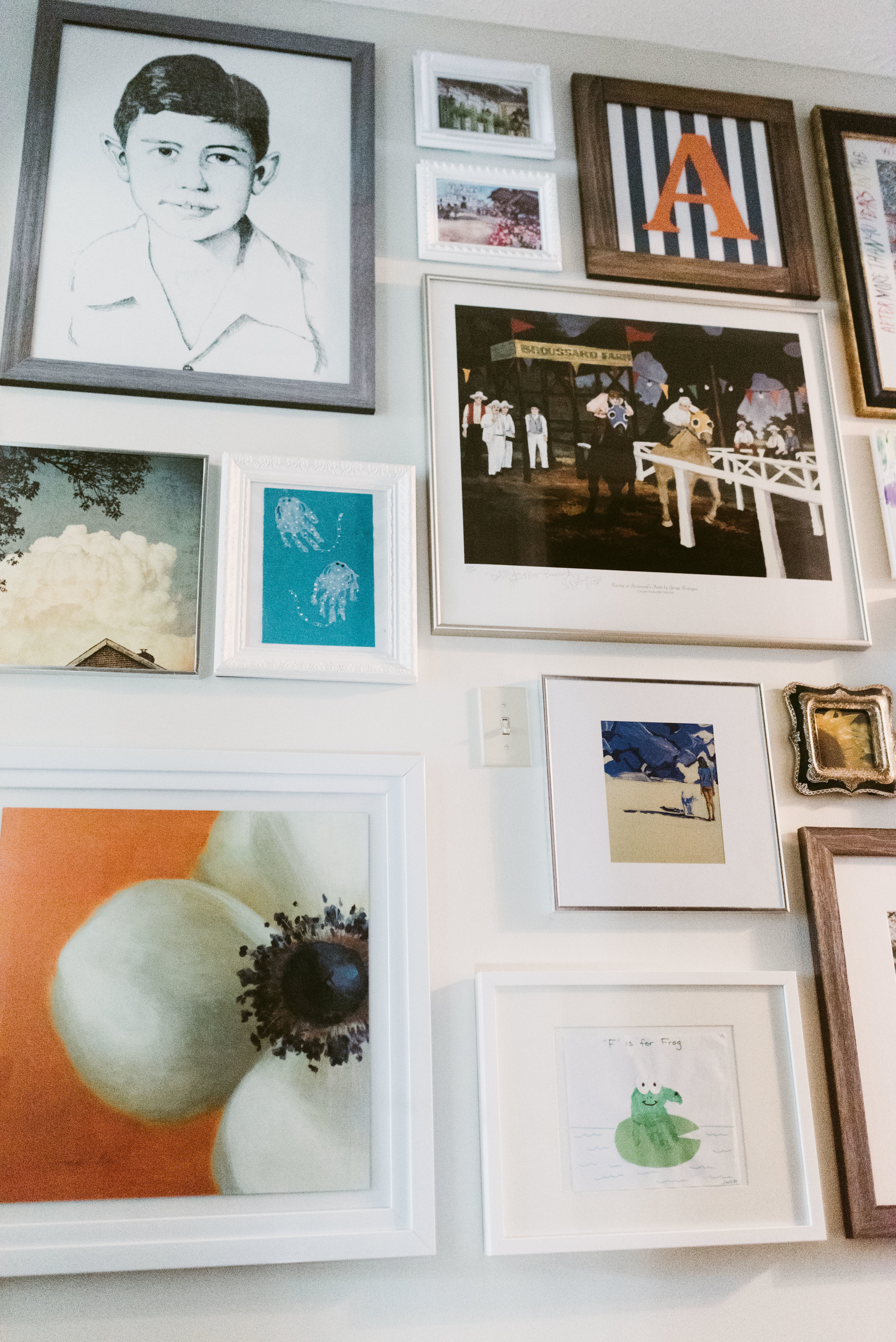
Styling a neutral, symmetrical console or sideboard.
This week kicks off our “Reel Styling Wednesday” series! Hopefully this series gives you the confidence to style your own home. We are starting with console styling; this can be done in an entryway, a hallway with enough space, or any blank wall in a room.
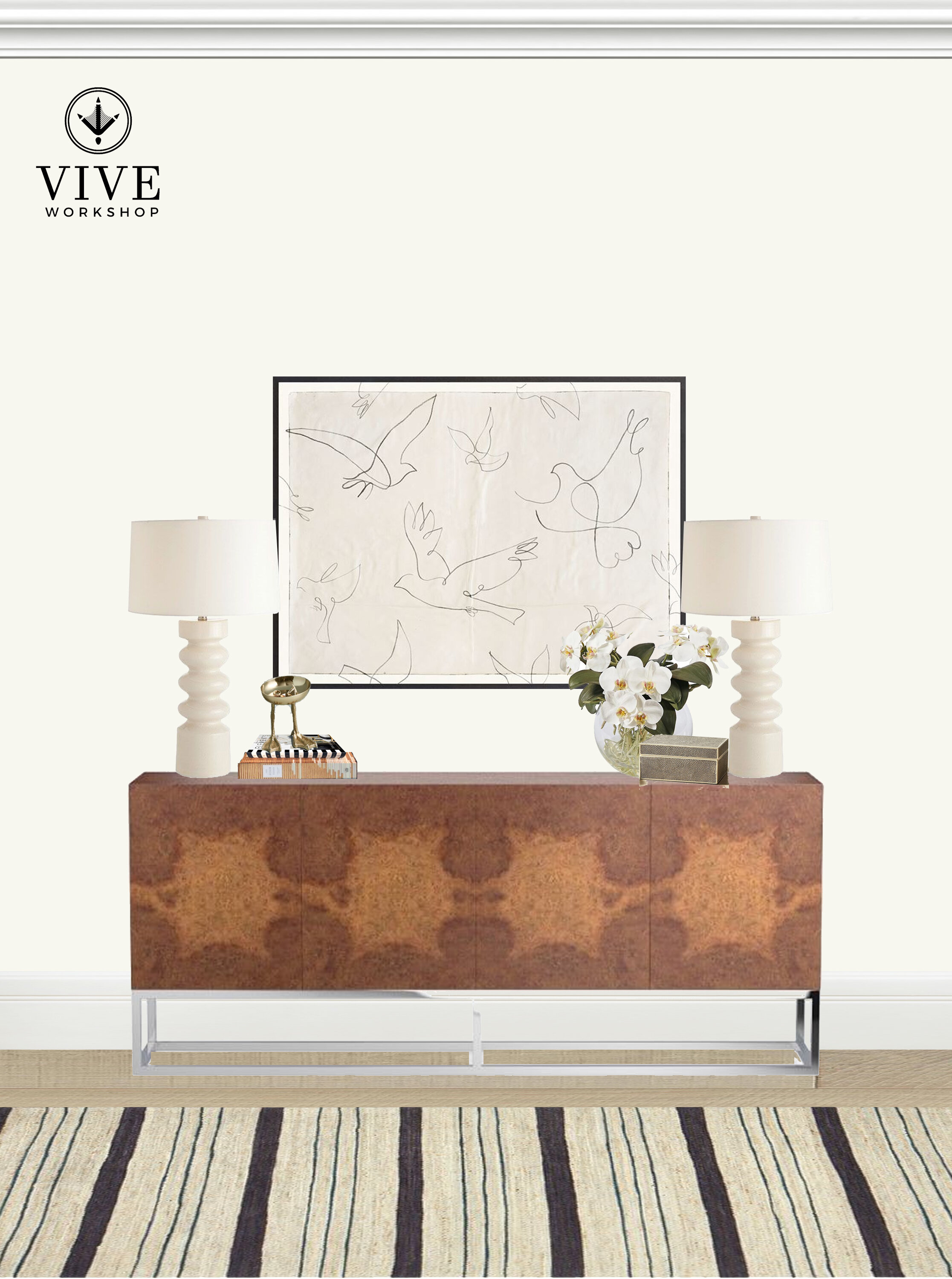

I have had many clients mention that they love neutrals and “don’t want to use any color”. It’s important to note that just because we love color here at Vive Workshop, it doesn’t mean we cant work with neutrals. Sometimes I add interest with layering neutral patterns, but not everyone likes pattern. The key pieces to adding interest in an all-neutral space is layering texture and tones.
You’ll notice, over the course of this series, that styling is not black-and-white. There are no hard and fast rules. I usually have a few go-to ways to style and allow myself to edit from there, so these steps are the way I achieved this look.
STEP 1: MAIN BASE PIECES
This is sort of a two-part step. Select your console and your rug because these are the largest pieces that will guide you. It’s possible to select your rug last if you prefer that method.
I selected a console that had a distinctive wood grain. Because that “pattern” was more organic, I juxtaposed it with a linear rug. A woven textural rug with natural color variations and striking black lines run into the warm wood console with a burl wood pattern.

STEP 2: ASYMMETRY VS. SYMMETRY | art and lamps
This is where you’ll have to make the decision if you like symmetry or a more relaxed, asymmetrical vibe. The size of the console can make this decision for you. If it’s smaller, you will only be able to fit one lamp.
For this styling, I chose symmetrical. The art art was the main basis for this decision; it was a large, landscape format. I love the hand-sketched quality and wanted it’s simplicity to be the focal point. The large console also allowed for two lamps so I chose white lamps with a glossy wave; again layering textures.
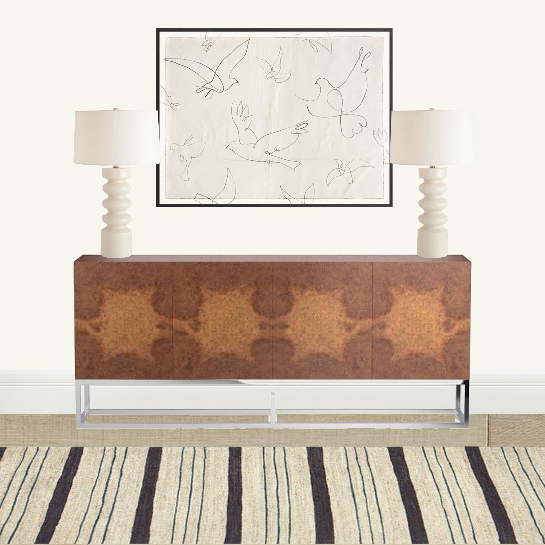
STEP 3: LARGEST ACCESSORIES
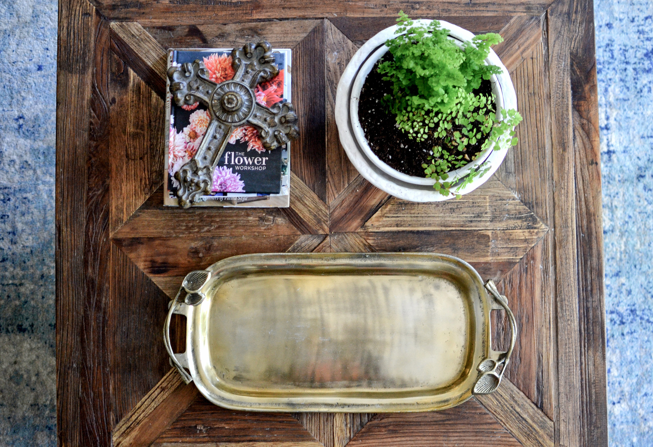
In this step you’ll start layering in accessories. I start with my tallest pieces; most of the time these are my plants/florals. I like to add a “natural touch” to my styling because if softens the composition.
I also start adding pieces to stack and create taller pieces. I usually do this with books in the color scheme I’m going for, boxes, or some type of acrylic/marble pedestal.

STEP 4: FINAL ACCESSORIES
I try to do groupings when styling. I’m also a firm believer that negative space is just a nice as the items I place on the shelf. While I could fill this whole console, I prefer to keep the center free of anything to frame the art.
Most of the time, odd numbers are best when grouping. On the right I added a textured box to keep less attractive trinkets. On the left, I added a metallic finished, footed bowl for entryway keys. The feet on the bowl add some personality. I love finding sculptural pieces that add a little quirkiness and a little extra shape to the whole.

I hope you enjoyed week 1; look forward to more every Wednesday!
-NIKKI

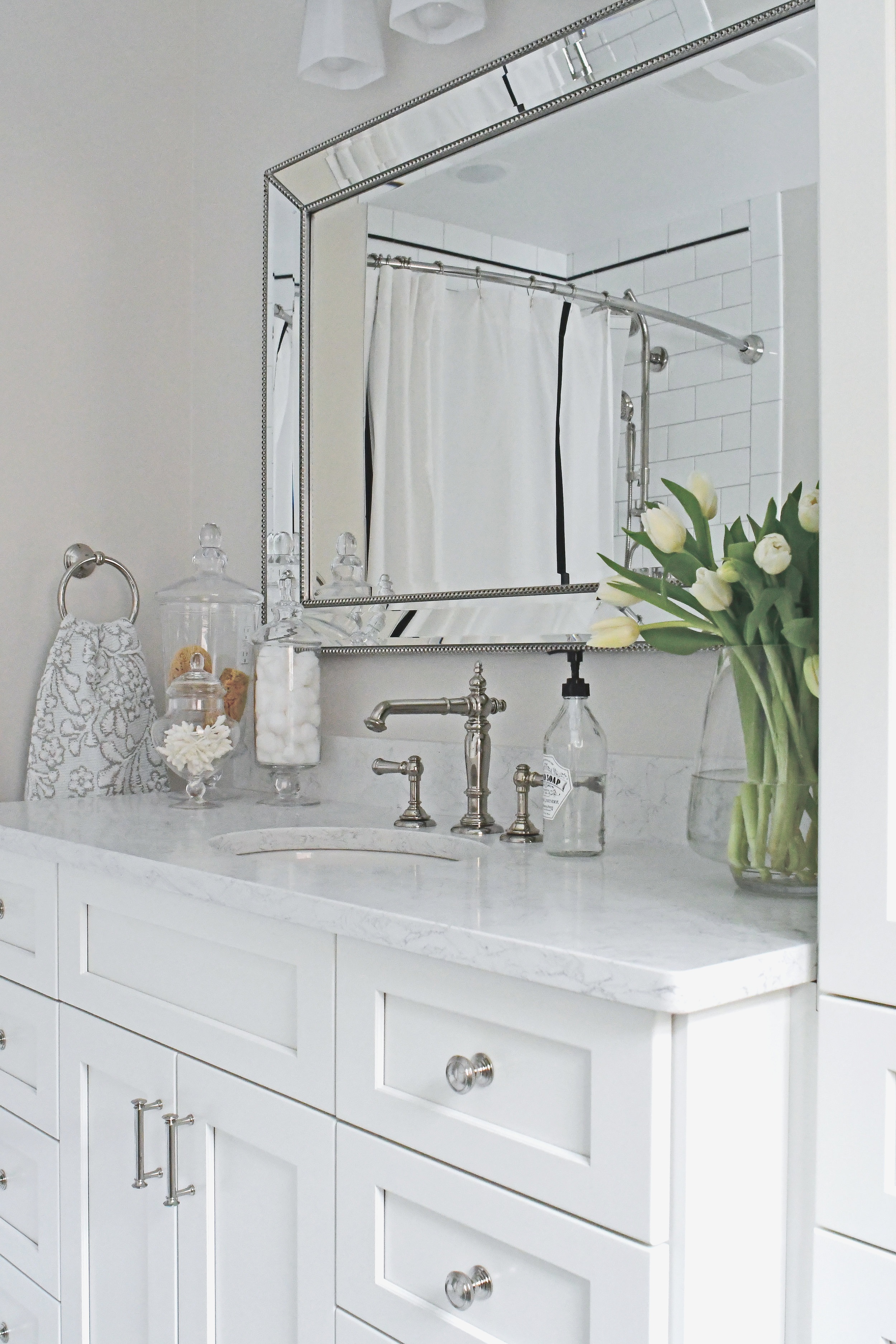
Elm Classic Bath Renovation
Over the summer I designed a 1939 bathroom renovation and just had to get the photos to share with you before moving to Houston. This home is a beautiful older home in a nice Cleveland neighborhood, with historic character, but the only bathroom was not functioning well for the family.


Before: Same view as above
The first priority was to better utilize the space they had by combining the tub and shower. They also needed more storage and counter space. This bathroom serves as a master, children, and guest bath until they add a master bath later on so the large storage cabinet can allow for multiple uses. I chose to keep the toilet in its existing location to keep the cost of moving plumbing down.


Before: Same view as above


The second priority was to freshen up the space while combining the classic style of the home and the homeowner’s aesthetic. The black and white basket weave tile was one of the initial selections and an essential part in keeping the classic feel. In fact, when the peachy pink tile was pulled up, the contractor found remnants of a similar black and white tile used originally.

The client wanted to keep everything neutral so I chose a light, warm gray paint and polished nickel fixtures to keep the bathroom from feeling too “cold”.
I love how the final product came together to feel airy and classic, but still current enough for this young family. It’s a space you can walk into and feel comfortable.
Design: Vive Workshop, LLC
Contractor: Oster Services, LLC
Photography: Cleveland Real Estate Photo (Tom Schuerger) and Vive Workshop, LLC

Industrial Hangout Project
Almost two years ago, a repeat E-Design client contacted me to help them with a metal building addition. They wanted a comfortable, industrial-style space to be used for entertaining and hosting for company, family, and school functions. This project is in Oklahoma and was more than a typical e-design project because of the level of detail. We did everything remotely via emails, phone calls, and occasionally face time. It’s amazing what wonderful results can come from working well as a team.
This addition is one large, open room that serves several functions. The first thing I did was work on space layouts. It became clear that we wanted to divide the space into three zones.

THE GYM:
The husband is an Iron Man who trains, regularly, for triathlons so the first requirement was to move the current work out space, located in the main metal building, to the addition. The second requirement was to convert the current office in the main building into a spa-like bathroom with lockers for everyone who comes to work out; including their three boys.


This bathroom would have access to the main building, but also needed to be accessed by the new gym so we made sure to locate it just off the bathroom. The lockers have a space for shoes below, a basket above, and doors with mesh screens. A bench is centered between the shower and lockers for changing, and the laundry cart next to the lockers holds dirty towels. Behind the industrial vanity is a statement wall of square black clay tile.


The client really wanted monkey bars somewhere so we used that as our “divider” between the gym and entertaining spaces. The entertaining portion includes a full kitchen and a lounge area where they can project movies. The monkey bars serve as a great transition space and provide plenty of entertainment whenever guests want to have a friendly competition.
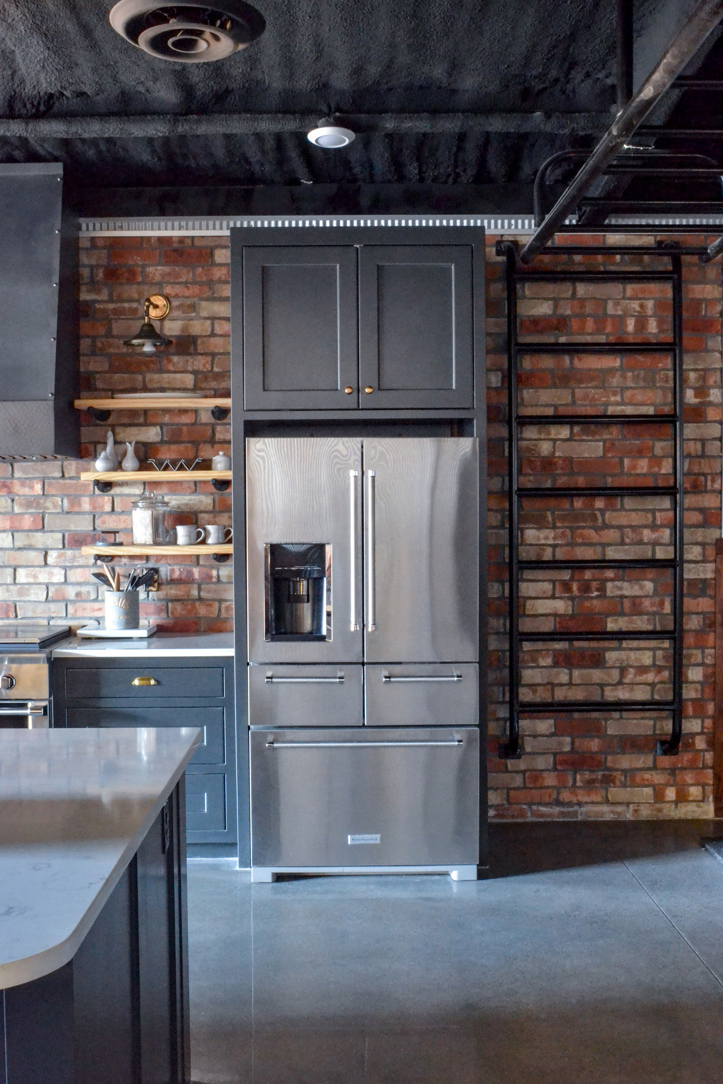

THE KITCHEN:
The homeowners already knew they wanted large barn doors to open into this space. I used that visual as an opportunity to highlight the kitchen. We put the hood directly in front of the door which was centered on the wall from the main building. We also had some room for a hand-made farmhouse table. Holiday meals and game nights will happen here.


We tried to infuse the space with industrial details, while keeping warm tones like wood and brass to make it feel more comfortable. The barn doors are a warm wood with a rich grain and diagonal detail. The wood can also be seen wrapping around the lower portion of the walls. In the kitchen, grey-black cabinets were paired with a white quartz and brass hardware. I always try to mix metals in a kitchen to create a layered look. One of my favorite elements is the floor-to-ceiling brick behind the cabinets. It was a great way to add texture and reinforce the kitchen “zone”.
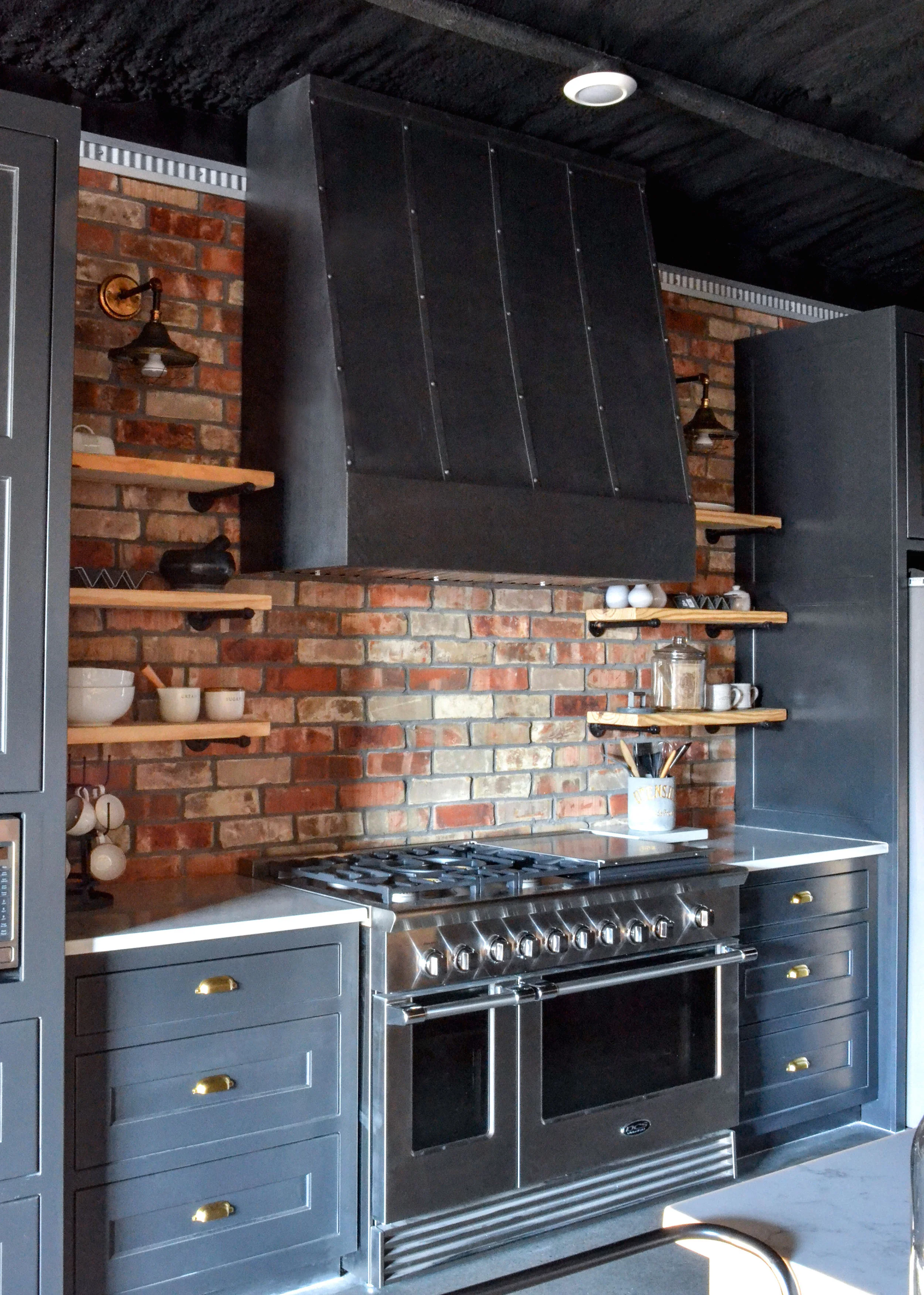

The large metal hood makes a statement over the 48” range. We used open shelving on each side with industrial sconces to light up the items on display and add light to the work surfaces. A bar cart sits against the lounge side of the island to create an open-shelf extension that can be moved to the game areas whenever needed.


THE LOUNGE:
The lounge area was placed in the front of the building, next to the large, black steel window. This area needed to be comfortable and versatile. A large charcoal and white rug anchors the space. Card games are stored on the coffee table for easy access. A projector shines onto a wall-mounted screen for family and friend movie nights. Behind the sectional is a shuffle board table, lit with sconces that flank a deer mount from the family’s hunting ranch.


Red Dirt Relaxed Project
I was recently able to travel and photograph an E-Design project I completed last summer. This home is the couple's 18th move! Yes, you read that correctly. You can now pick your jaw up off of the floor. The wife is a real estate agent who really knows how to select a good home and has an amazing sense of style, but after 18 moves is burnt-out of constantly having to decide how to do each of their homes. On top of that, she was getting tired of her tan, red, orange color scheme and wanted a change. She really wanted something that she wouldn't normally select, so she contacted Vive Workshop. We started in her dining room, as it was the most bothersome to her. It is open to the family room and the large table she brought with her just didn't seem to fit. She is also not a huge fan of art. She wanted something that could draw the eye's focus on the back wall, but didn't clutter it with a lot of heavy items. I selected a gorgeous printed wallpaper that wasn't too bold, but added some of the relaxed, fresh blue she was wanting. Because the room is only two walls and the curtains would be covering one of them, we decided to just wallpaper the wall you see when you walk in the front door.
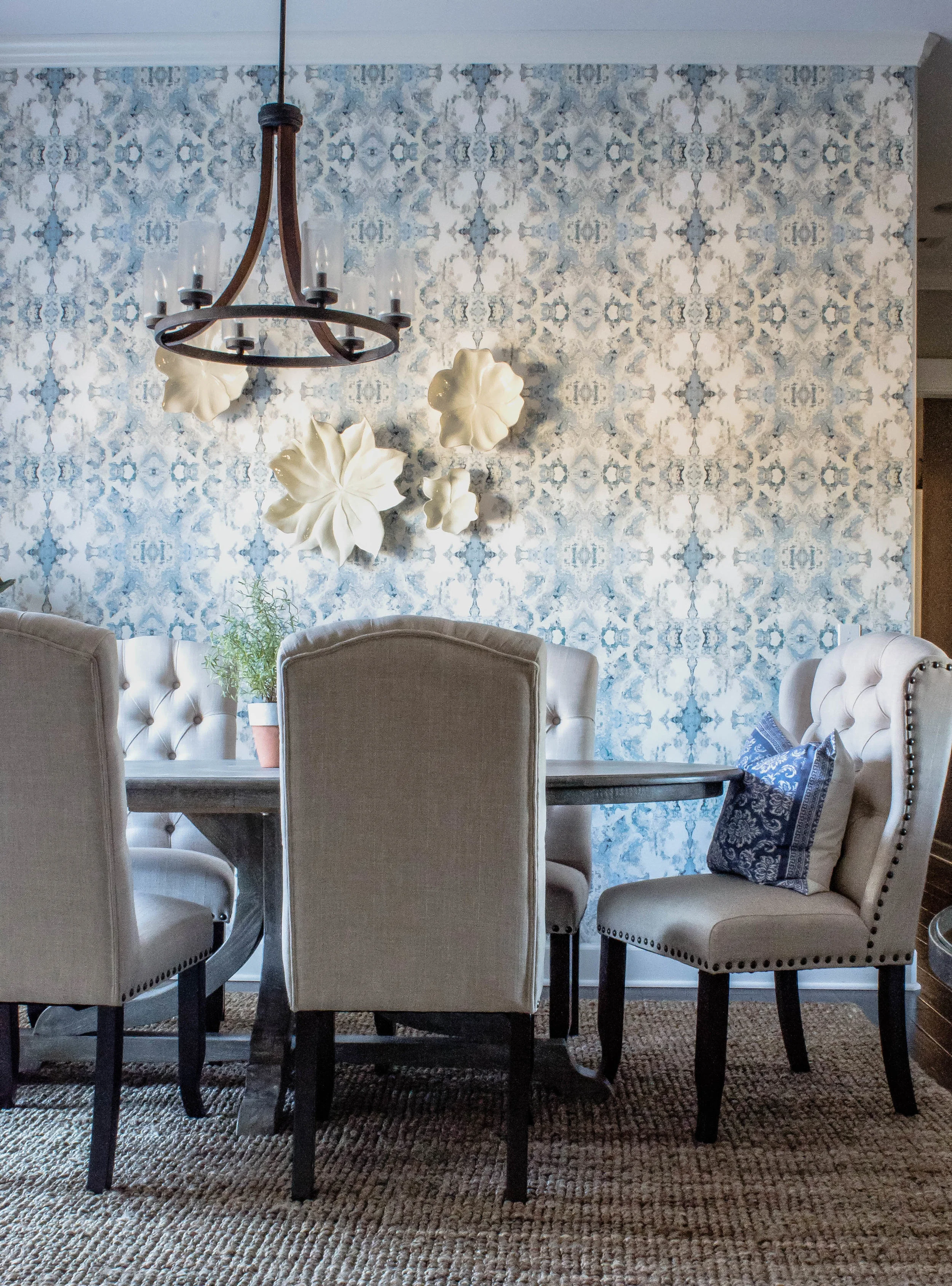
I selected an oval table that was large enough for seating several people, but wouldn't block the walking path. We kept the room pretty neutral besides the paper. We selected natural, white curtains and chairs that paired well with the textured woven shade and rug. White flowers layer on top of the wallpaper to add interest, but not weigh the wall down.

Her entryway needed a small anchoring piece of furniture and nothing seemed right. Then, by a stroke of luck, I found this amazing round table. It adds the perfect amount of character without trying too hard.
Lastly, her family room didn't feel finished. There were cabinets on each side of a large, stone fireplace that felt dwarfed, in scale. She also felt like all the dark wood felt broken up. We decided to make the wall appear as a cohesive set of built-ins. We installed ship-lap above the cabinets and had both sides painted a color that would serve as a transition between the grey walls and slightly golden-hued rock. It's amazing what paint can do! After mounting their tv on the left side, we found a botanical art that she already owned to hang on the opposite side and give the impression of symmetry.


I hope you enjoyed this tour! To find out more about the services we offer, click here.
Nikki

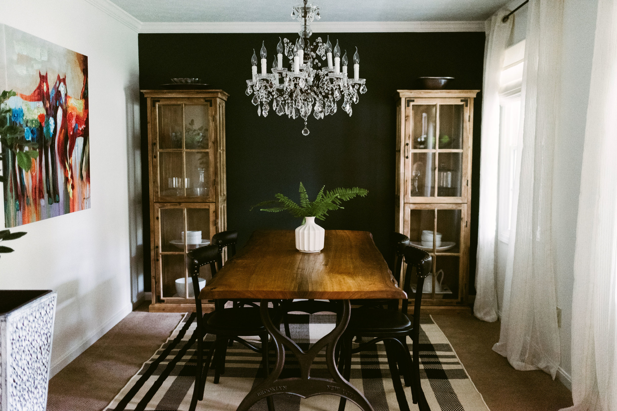
South Meets Lake- Cottage Tour- Part 3
At the beginning of the year, I shared part 1 and part 2 of the #VWSouthMeetsLake Cottage Tour. It's safe to say that these last two rooms are long overdo. If you've missed or forgotten what the cottage looked like, simply click on the links above. Honestly, posting about this cottage in the summer time seems much more fitting. There are traces of the water, nature, and nautical life throughout this cottage. The main color scheme of the house is blue and green, but accents of warm tones run through-out, as well.
The family room is right off of the kitchen and overlooks the backyard. This room gets the best light in the house, so it's where the majority of the plants reside. The family spends most of their time playing and relaxing in this room. I wanted it to have some southern charm so I used a coffee table with a rough wood finish, antique accents, a chesterfield sofa, and a large picture of a live oak tree over the sofa. Just like every other room in the house, nothing is too precious. I mixed materials and patterns to create interest, but also so that if something ever needs to be changed out, it can be done without making it look like a piece of a "set" is missing.

Photo from real estate listing


The Master Bedroom is next to the family room. This room has a window, doors to the bathroom and backyard, and large closet doors which leaves very little wall space for furniture. Any furniture that was used needed to feel light and fresh so that the room wouldn't feel weighed down. Along with that, I wanted to use a paint color that would bounce light and still give the room a calming feeling. I went through so many paint color samples and NOTHING I had used before felt right. I finally landed on pink, of all colors. Getting the correct shade of pink was crucial to make sure it would not feel like a baby girl's nursery.

Pink can really intensify once it's covering the walls, but this pink feels like a warm, glowing sunset over the water. I combined it with accents of black, blue, and green to pull it a little more towards the masculine side.


I hope you’ve enjoyed this home tour. To get more design inspiration follow me on instagram and pinterest.
Nikki

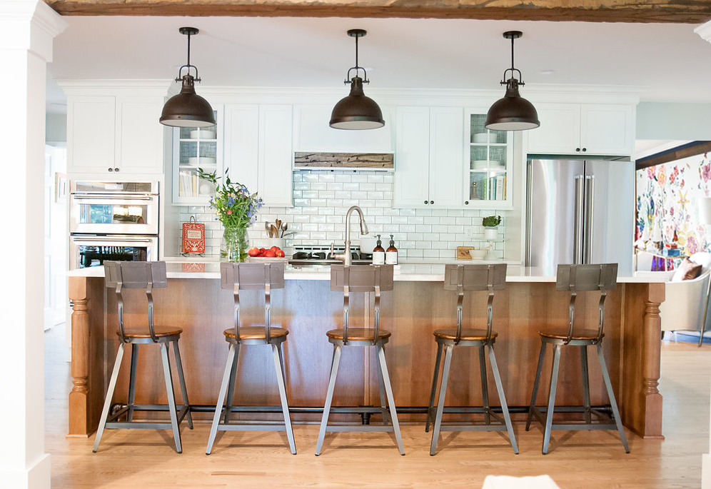
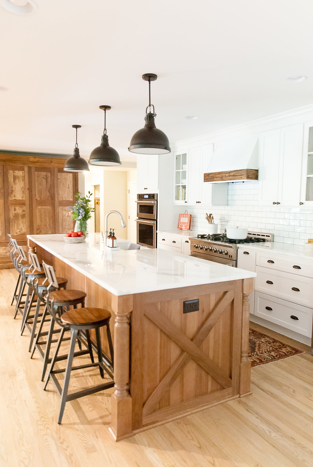
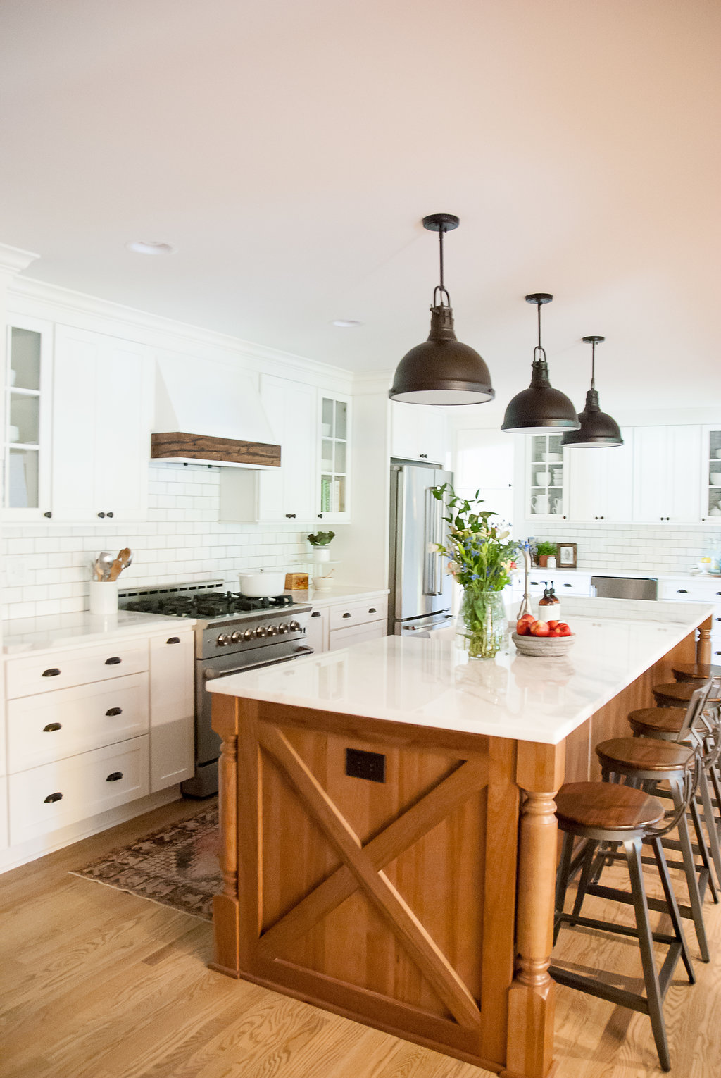
Bay Dream Kitchen Reveal
Last fall, I was contacted to help bring a family's vision of their dream kitchen to life. They had moved into their home a couples year earlier, knowing that they would eventually redo the dark and dated kitchen. Not only was the kitchen dark, it also wasn't functioning well for a young, busy family. The table where they had most of their meals was next to the family room (behind the kitchen), there was a formal dining room next to the kitchen, and a formal living room in front of the kitchen and dining. With three young kids they wanted to take advantage of all unused the space.
Here's the before:

View from family room

We decided to open up the wall between the existing kitchen and formal dining room to create a large kitchen. We also removed the load bearing wall between the kitchen and family room to allow for more light and give the area a better flow. I designed a large island that seats the entire family and stretches across the kitchen. The two columns that take the place of the wall line up with the island, and a large wooden beam that coordinates with the vent hood runs the length of the kitchen to give the impression of separation from the family room.
The homeowners wanted a timeless kitchen that was mostly white, but that had an "organic and farmhouse" feel. They had a a sliding barn door with a diagonal trim piece, in their family room, that we took inspiration from for the island detail. The combination of white and wood grain always feels so balanced and timeless. Details like the vintage runner, patterned wallpaper on the back of the glass cabinets, and greenery added to the organic feeling.


Photography: Sweet Magnolia Photography
Contractor: Bennett Builders

South Meets Lake- Cottage Tour- Part 2
Today, I'm sharing part 2 of the #VWSouthMeetsLake cottage tour. I showed images for the entry, dining, powder bath, and the kitchen in part 1. Now, I'm taking you to the second floor of the house. The stairway is across from the entry, so you can see a glimpse of the small hallway when you walk into the house. I wanted it to spark some interest and give a hint of the fun that happens upstairs (the kid's area). I arranged a large collage of art collected over the years and included art done by the kids.

The kid's bathroom didn't change too much. A new mirror, wall hooks, updated paint, and wall decals refreshed the room and made it feel like a fun space. Small bathrooms are great places to add pattern to walls (decals or wallpaper) because the small area is better for your budget and is not as big of a risk as an entire, large room. So if you want to make a statement somewhere, but are a little nervous, start with a bathroom.

Before Bathroom
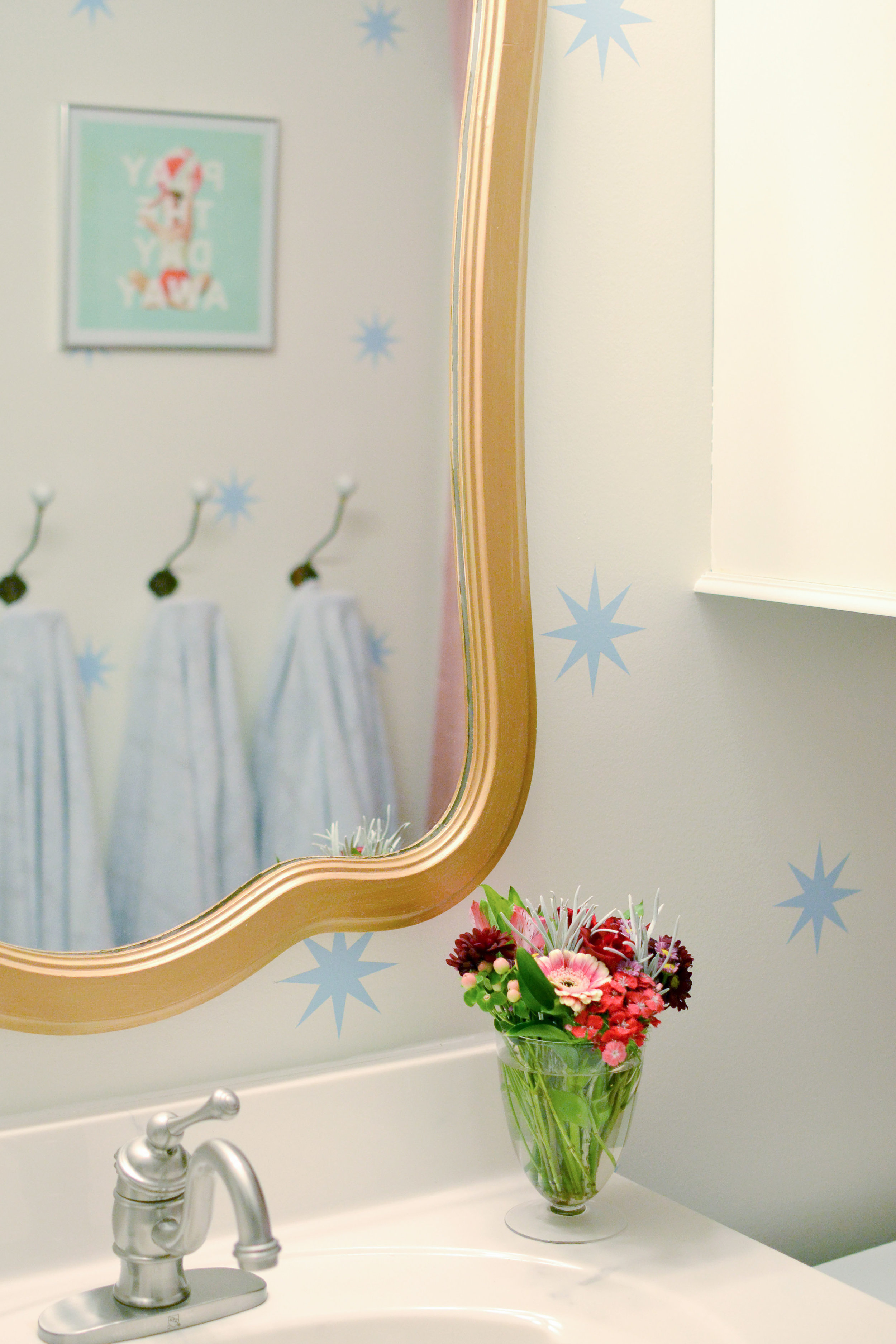
After

The little girl's nursery is a HUGE room, so arranging the furniture to fill the space but not letting it get too cluttered was a challenge. I used a rug and furniture groupings to create different "sections" in the room. I wanted to keep the walls gender neutral in case the kids share a room in a couple years, so I added the girly touches through textiles, furniture, and accessories. The furniture was re-used from 3 different spaces, but it was key to try and keep the lines similar.


Before Pic
The before picture shows just what a big difference paint can make. The color-blocking paint trend is also a great way to de-emphasize the diagonal ceiling/wall in an upstairs space. Make sure the "break" in color starts at the bottom of the diagonal and continues throughout the room.

Guest Bed
I separated the dormer area with a textured, sheer curtain to created a little play space and reduce the scale of the room.
Dormer Window

Both kid's rooms have attic access doors that originally were flat panels that had screws to close them. We updated the look of the doors and added hinges so they would open as doors. One of the attic spaces has wired lights and connects the rooms. We have started adding carpet squares and chalkboard walls to create a little playroom/hide-out area. I will share when it is finished.
Next, the little boys room. This room had blue carpet that was in decent condition and wasn't in the budget to change out. The initial design stage focused on creating a room that would work with the blue, and make it look purposeful. While there isn't a "theme" in the room, since the house is a lake cottage, the "lake house" vibe is very fitting.
After

Before
I had the walls painted white and installed shiplap to the back wall to add interest. There are red/orange and blue details throughout the room to give hints of "nautical". I also installed a floating window seat in the dormer. This seat can be used for reading when he gets older, but for now serves as the perfect train table.


Part 3 (the living room and master) are still in progress and will be posted whenever they are finished. I hope you've enjoyed this home tour. To get more design inspiration follow me on instagram and pinterest.
Thanks,
Nikki
South Meets Lake- Cottage Tour- Part 1
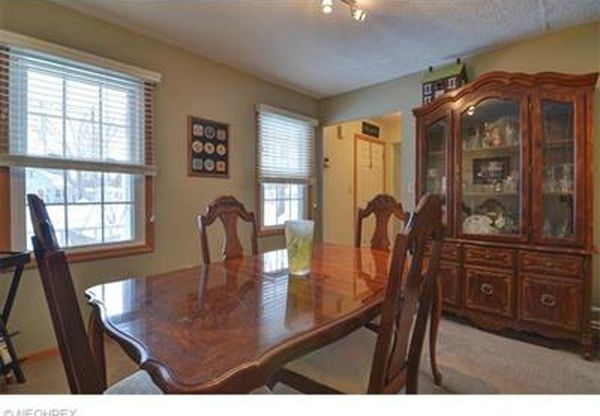
Today I'm sharing part one of the #VWSouthMeetsLake Cottage Tour. Built in the 90's, this cozy cottage (less than 2,000 sf) was in need of some very budget-friendly updates to make it a place a young family of four could enjoy. I've been working on the updates to this home, slowly, for the last year. Located just walking distance from the shores of Lake Erie, it was designed with the traditional cottage front porch that everyone loves. However, some of the interiors felt dark and closed off from the other areas.
I took inspiration from the nature all around Lake Erie, and tried to tie in fun color and pattern representative of a young, fun family. A big goal for this design was to make the interiors feel stylish enough for the adults, but not too precious that the young children couldn't enjoy it.
Before, the dining and entryway were pretty closed off and dark. Separating the dining room from the rest of the house left it feeling more like an office than a dining room.
Dining Before
I had the wall between the entry and dining room opened up and installed a new, wooden door with glass to let in more light. Painting the back wall of the dining room and placing a curio cabinet on each side helps to create a more dramatic backdrop verse the pass through that it was before.

Dining Before
The powder bath is as small as you can get and still be functional. I just wanted to keep it simple with a white wall on top and black shiplap under the chair rail.

The kitchen before had so much floor space that you could literally dance across the room, but there was a lot of wasted space. When it came to cooking there was barely any prep area and not much storage.

Kitchen Before

Kitchen Before
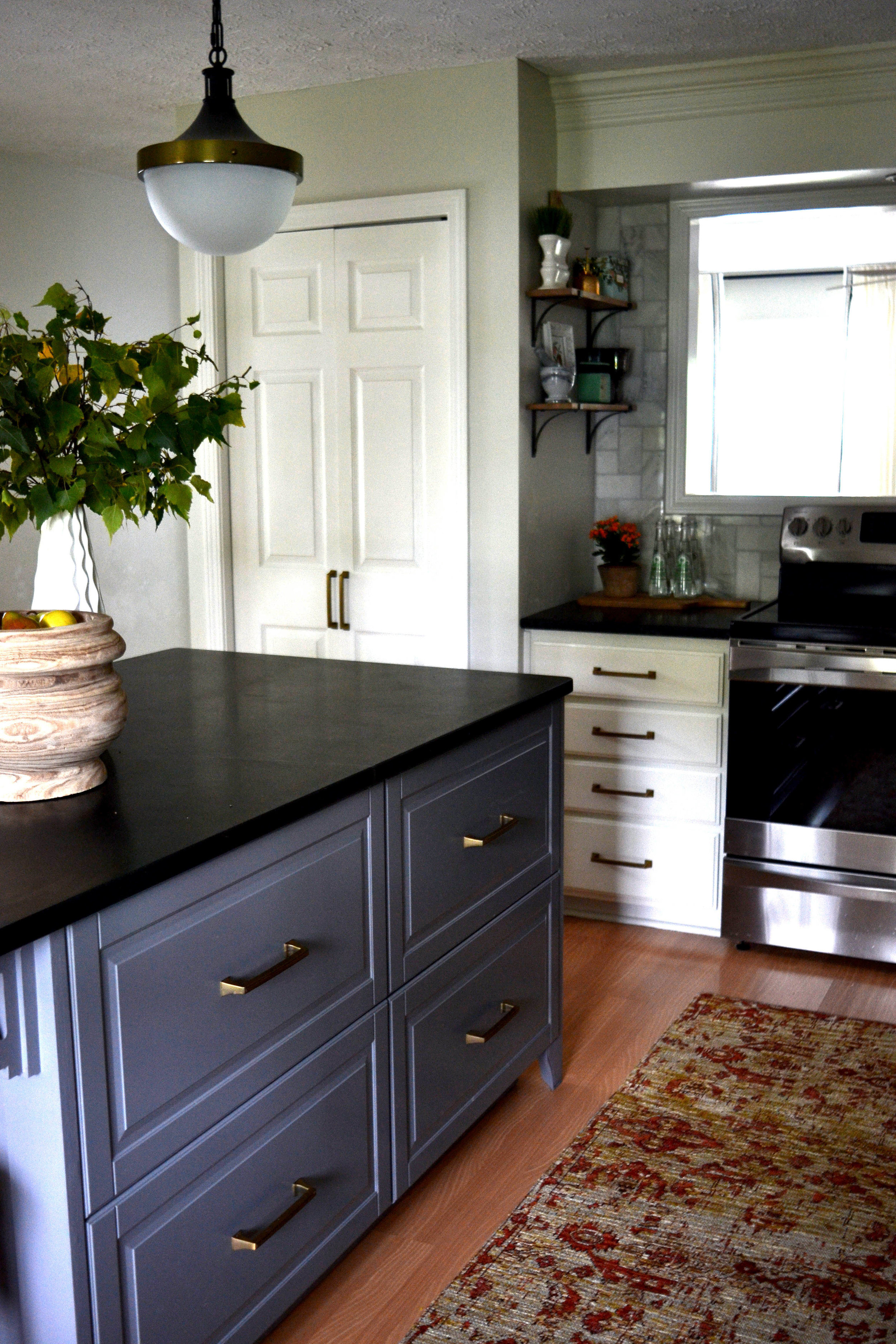
I designed an island that fit a couple bar stools in the center of the kitchen. I also had the wall of cabinets moved to the laundry area of the basement. In its place, I installed a wall of floor-to-ceiling cabinets. These cabinets now hold the microwave, toaster oven, hooks for coats, and drawers for shoes.
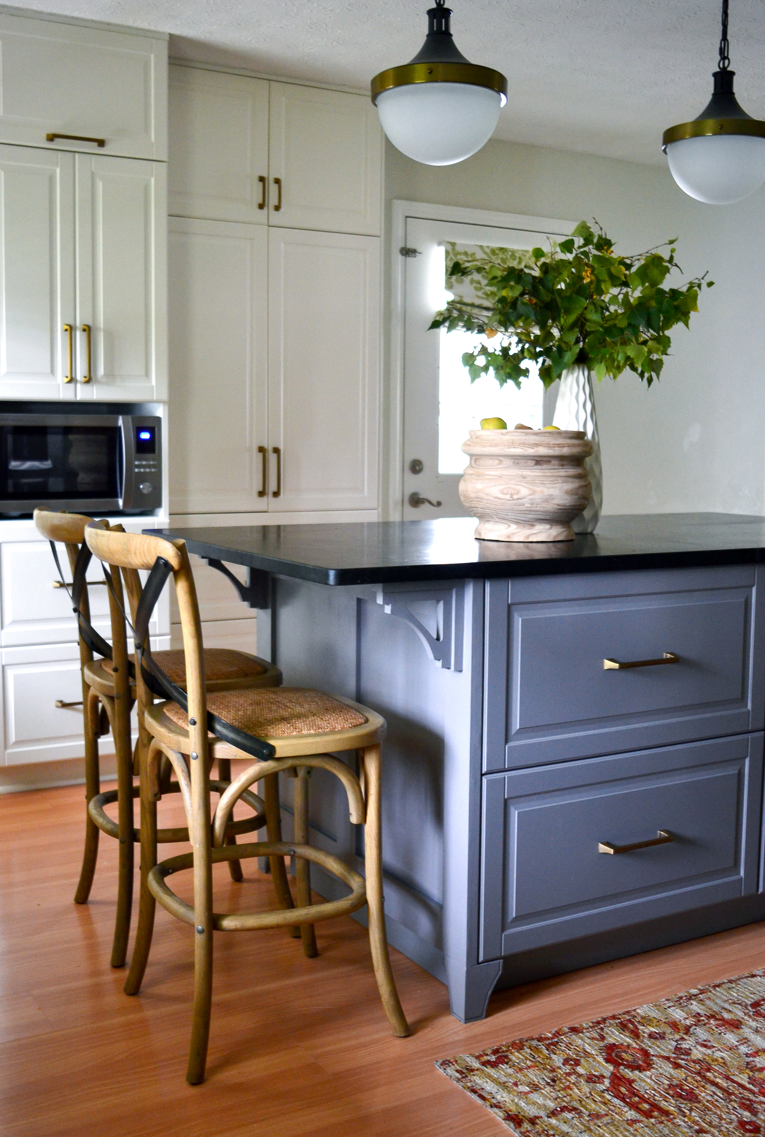

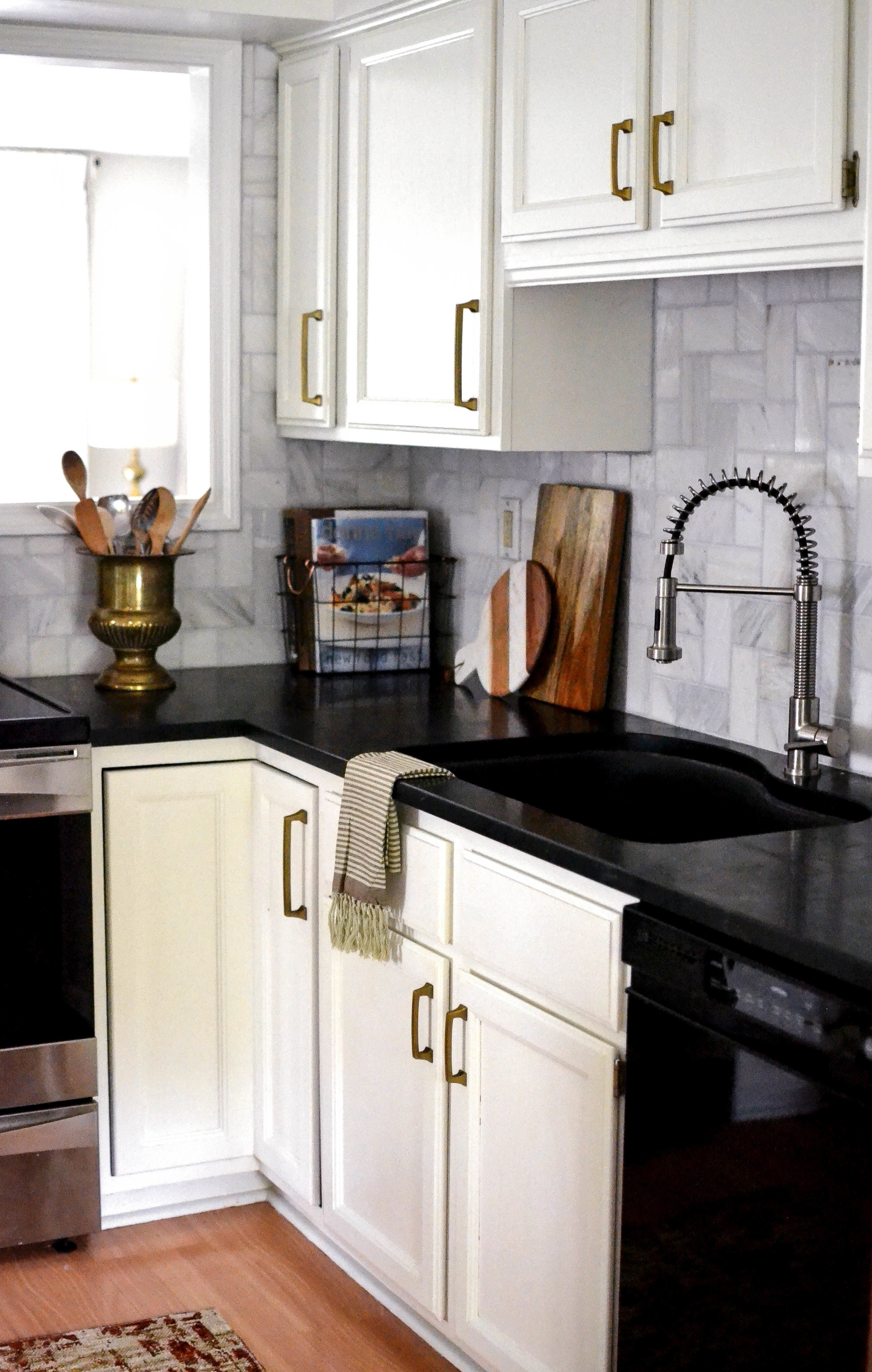
The laminate counter top was replaced with soapstone, and a marble back splash, in a fun pattern, replaced the 4 inch laminate ledge.

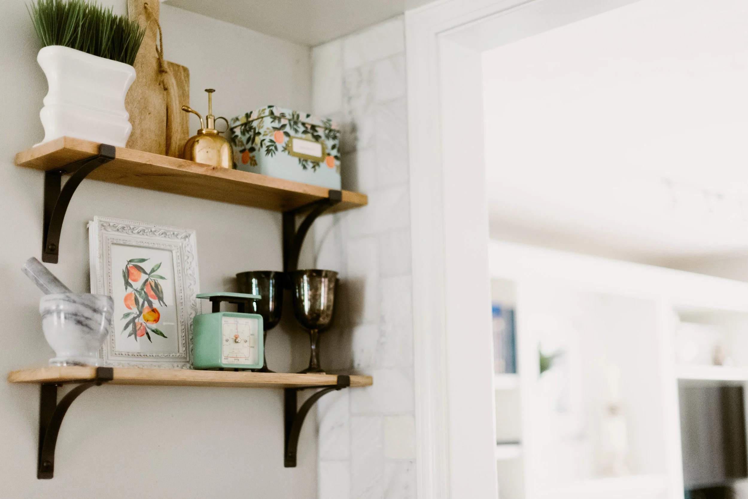

Closing out the tour for today, the hallway at the top of the staircase which can be seen from the front door. This hallway leads to the kid's rooms, so I decided to use the small area to display the family's collection of colorful art; including art done by the kids.
I hope you enjoyed part 1 of the tour. Part 2 will be posted in February, so stay tuned! For more inspiration follow me on pinterest and instagram!
Nikki

2017 Trend Predictions
A new year is always an exciting time to freshen things up around your home. I love looking for trends in design, and trying to use them in a way that makes them more classic and less "trend". Design trends typically follow trends from other areas, like the runway. Unlike the runway, these "trends" can last years. Here are my predictions for 2017: Green
Over the past year deep greens, sages, and emeralds have been popping up more and more. Then, Pantone picked Greenery for their 2017 color of the year and that was all I needed to know that green will be a big part of 2017. It can be a subdued sage, a pop of chartreuse, a moody, deep green, or a bold emerald.
I've seen walls, cabinets, and accessories that all incorporate green effortlessly. It’s a pretty easy color to integrate into your home with accessories; especially with the blues that have been popular in recent years. I love chartreuse against navy. Green also looks amazing against the bright whites that were color’s of the year, in 2016. If you’re wanting a change from the blue bathrooms that have been popular, try a subtle shade of green on the walls or an emerald vanity with white walls for a change. In a nursery or kid’s room, it is a fantastic gender neutral color.


Bringing Nature Indoors
Having indoor plants is nothing new, however, with the popularity of succulents that need little water (and some with little light) I’ve seen indoor plants in every room of the house. They are fantastic for softening a space and cleaning the air. There’s also something about plants that lift your mood.
You don’t need to bring an actual plant into a room to bring in nature. Floral prints, butterflies, and landscape art and murals are also ways I'm seeing nature being incorporated. If you don’t have a green thumb, you can always use art and accessories, wallpaper, or window treatments to incorporate nature.


Texture, Texture, Texture
Whether you love neutrals or color, texture adds interest and gives your space a layered look. Faux fur accessories and hide rugs add the layer of cozy during the cold, winter months. Jute and sisal rugs remain pretty neutral while adding interest with a large area of texture. Marble and velvet are textures that can add a bit of glam to the space. Try combining several textures so your space can feel as good as it looks.
When it comes to built-ins, after years of having painted cabinets as the finish of choice, natural wood cabinets are making a huge comeback. If you feel like you just painted your cabinets white, try white cabinets with natural wood island (or table as an island). In a kitchen, the combination of wood and white cabinets will always look classic.
For the walls, shiplap is still a great look and painted brick is gaining popularity, again. In fact, subway tile back-splashes are going a step further by adding texture with pavers and clay tiles. Both are a great way to add texture while maintaining the monochromatic color palate.


Well-Crafted
After years of DIY popularity, people understand more of what it takes to make something really well and are treasuring their pieces that are truly “art”. There is something to be said of a piece that has been handcrafted, carefully thought about, and made well. There has long been an appreciation of antiques for this reason, but local artists, builders, and crafters are also gaining more and more respect. This “trend” is also a push away from the spec and mass produced, and a need for people to have their home and surroundings tell their unique story. You can see this trend become apparent in hand paintings and murals, custom furniture and built-ins, pottery, hand-made and vintage rugs, and industrial style with more detail and sculptural elements (almost steampunk).


To find more design inspiration, you can follow me on pinterest.
Nikki
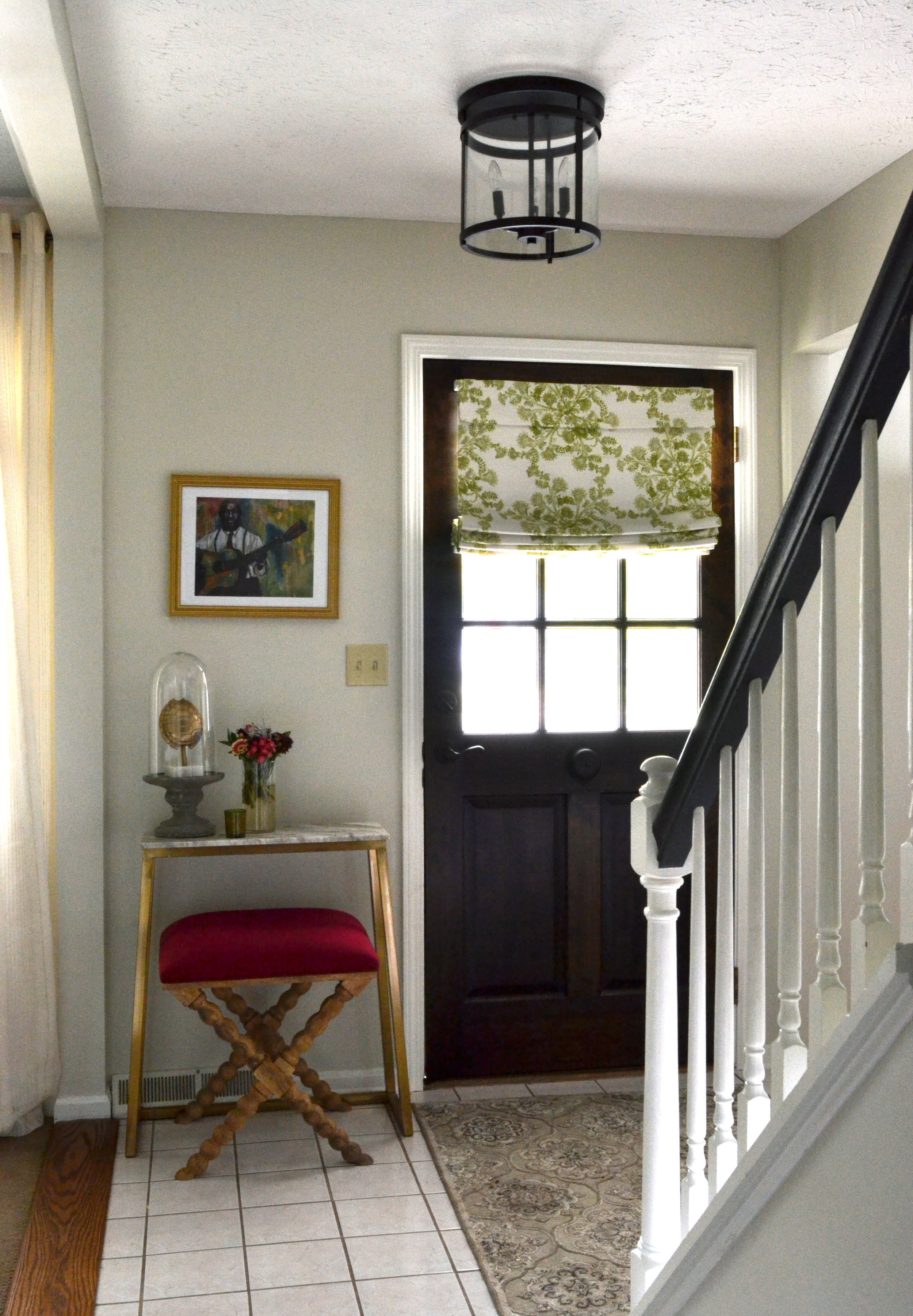
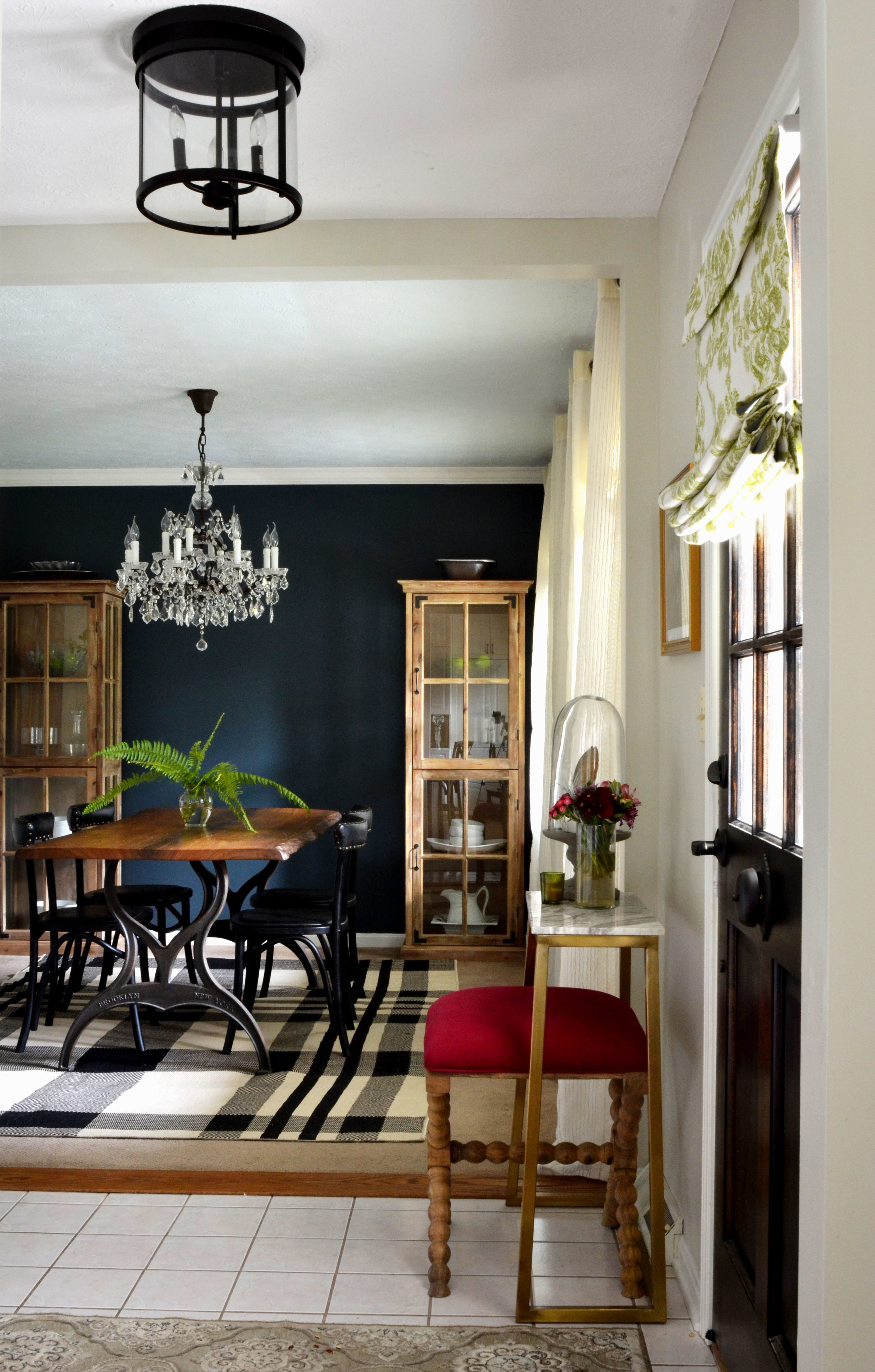
7 Tips To Create An Inviting Entryway
Curb appeal is the first thing a guest notices, quickly followed by your entryway, so when guests start filing in for holiday parties you want it to look and function as best as it can.

Front Door
Take some time to think about how your front door is working for your entry. This may sound silly, but the front door in our home was a solid black, metal door. From a far the curb appeal looked great, but we have a small entryway with very little light so having a door that blocked all natural light wasn’t doing us any favors. I noticed when we first looked at the house that everyone went in the side door and quickly passed through the small, dark entryway. We recently installed a wooden front door with a half-height window, so the light filters in and visually expands the space. Whether you do a black, wood, or colorful front door make sure it goes with the style of your house, attracts the visitor to come in, and lends itself to the look of your entryway.

Seating
I am not a clean freak by any means, so I never make anyone remove their shoes, however, I have noticed that most guests feel like they should (especially in winter, with snow). A small chair, stool, or bench is all that is necessary. Depending on the amount of space you have you can do a long, beautiful bench or even have an adjacent area where guests can go to sit.

A Place For Belongings
This can range from a place to set keys, to coat and purse hooks, to a basket for bags, to a coat closet nearby. Giving a guest a place to set their things make them feel like their belongings won’t always be in the way.

Rug
A rug is a great way to make a statement and add warmth to the typically hard entryway floor. You can use a round rug, runner, or large rectangular rug depending on the size and shape of your entry.

Plants
There’s just something about greenery and colorful flowers that say “welcome”. Not only that, but in the colder months, having greenery around your house boosts your mood.

Show your personality
Whether you do colorful art and prints, natural textures, or sleek candles and mirrors your entryway will begin to tell your home’s story. Also, speaking of mirrors, they are a great place for guests to quickly take a glance in or out the door, and will create the illusion of a larger space so they are great for small entryways.
Lighting
No matter what height your ceiling is or your budget, you can still have some fun with your entry lighting. Again, show your home’s style and make sure the light is mounted high enough to not get in the way of the door.
To find more entry inspiration, you can follow me on pinterest. Have a great Thanksgiving everyone!
Nikki
Our Adoption "Why"
 Our adoption 10 day t-shirt fundraiser has begun and $11 from each shirt will go directly towards our adoption. Every little bit helps, so if you would like to purchase a stylish t-shirt and support bringing our child home, here is the link: http://chromebuffalo.com/blogs/drive/117126277-tag-adoption?variant=9580384069
Here's why we are adopting and asking for support:
I have had some questions as to why we have decided to adopt. It is something that has been in our conversations for years.
I remember sitting in the living room, in 3rd grade, watching a news story about the baby girls in China being abandoned and thinking about how bad I wanted to help them. Then, in high school we visited Columbia, and while at a church, we watched as kids climbed a rock-side hill, barefoot, to beg for money with their milk jugs attached to long poles. Once someone would give money to a younger kid, the older ones would fight him for it. My parents would always take us to areas that showed us how lucky we were, while on vacation. They didn’t realize it then, but the images of the one-bedroom shacks and kids begging for money were etched into my brain in a way I could never forget.
I would casually mention to all my friends in high school that one day I would adopt. It was something Matt heard every time I spoke of a future family. The seeds had been planted, and throughout the years it seems like adoption is something that would keep coming back into our lives (and hearts) even if we weren’t really talking about it. Through church videos, Matt’s roommate, co-workers, and my volunteer work it was a constant theme. We always felt there was a child for us that wouldn't be "from" us.
Before we had Abram we would discuss in what order we should adopt. Then Abram and Julip were born and we moved. When we got to Cleveland we were just trying to settle in. Still, Matt had two new co-workers with adopted kids and another one who was adopted. He had a long discussion with the adoptee about how grateful he was to be adopted, and that was enough to get us talking again. We decided that we wanted another child, and that we would try through adoption.
I had heard (and seen first-hand) how many kids are in the US foster care system so, in January, I began contacting our county and separate agencies to start the process of fostering to adopt a boy/girl that is 5 years or younger. I was told by every agency that I spoke with that children under 8 are very rare and that it would not be likely that we could adopt one before moving in 2.5 years. They wouldn’t even let me start the process. I felt like my dreams were crushed.
We began looking into private domestic adoption. It was significantly more expensive and would most likely be a newborn. I kept seeing parent’s stories about them just hoping to be picked since they were not able to have biological children. I could not in good conscience take a newborn from a mom who has never had the ability to experience that fragile time.
Then my mom sent me a video of a women’s international adoption story. I had always thought it was WAY more money than any domestic, but the prices weren’t too much more. Matt asked why we weren’t considering adopting from Central/Latin America since I have always loved those places and the culture. We both immediately said, “Honduras”! We had just spent a day there on a trip and felt really drawn to the people of that country. We have researched just about every country you can (and cannot) adopt from and Honduras is still our top choice. The process will take us about 3 years. We are ok with that, though, we are trying to complete the paper process as quickly as possible because that is the only thing we have control of.
Since we are going to be doing some fundraising I want to maintain a degree of transparency with the costs. This adoption will cost us around $50,000. We have already paid $8,000 from our savings and will have approximately $15,000 more due this fall, when we submit our foreign dossier. Once that is submitted we begin the waiting game.
Once we get (and accept) a referral we will have to make 2-3 trips to Honduras for court and bonding with our child. The third trip we will be able to bring he/she home! We are so excited to meet our child for the first time and to watch the bond that will develop between our kids. Please keep us in your prayers.
Thank you, Nikki
A Special Family Announcement
We have a very special announcement to make; check out our video to see what it is! https://youtu.be/wXFwcDZA3ak
Music: Gone, Gone, Gone by Phillip Phillips
You can follow along for updates on our facebook page: https://www.facebook.com/tagadoption
or our Pure Chairty page: https://www.purecharity.com/taghehchian-family-adoption
Nikki
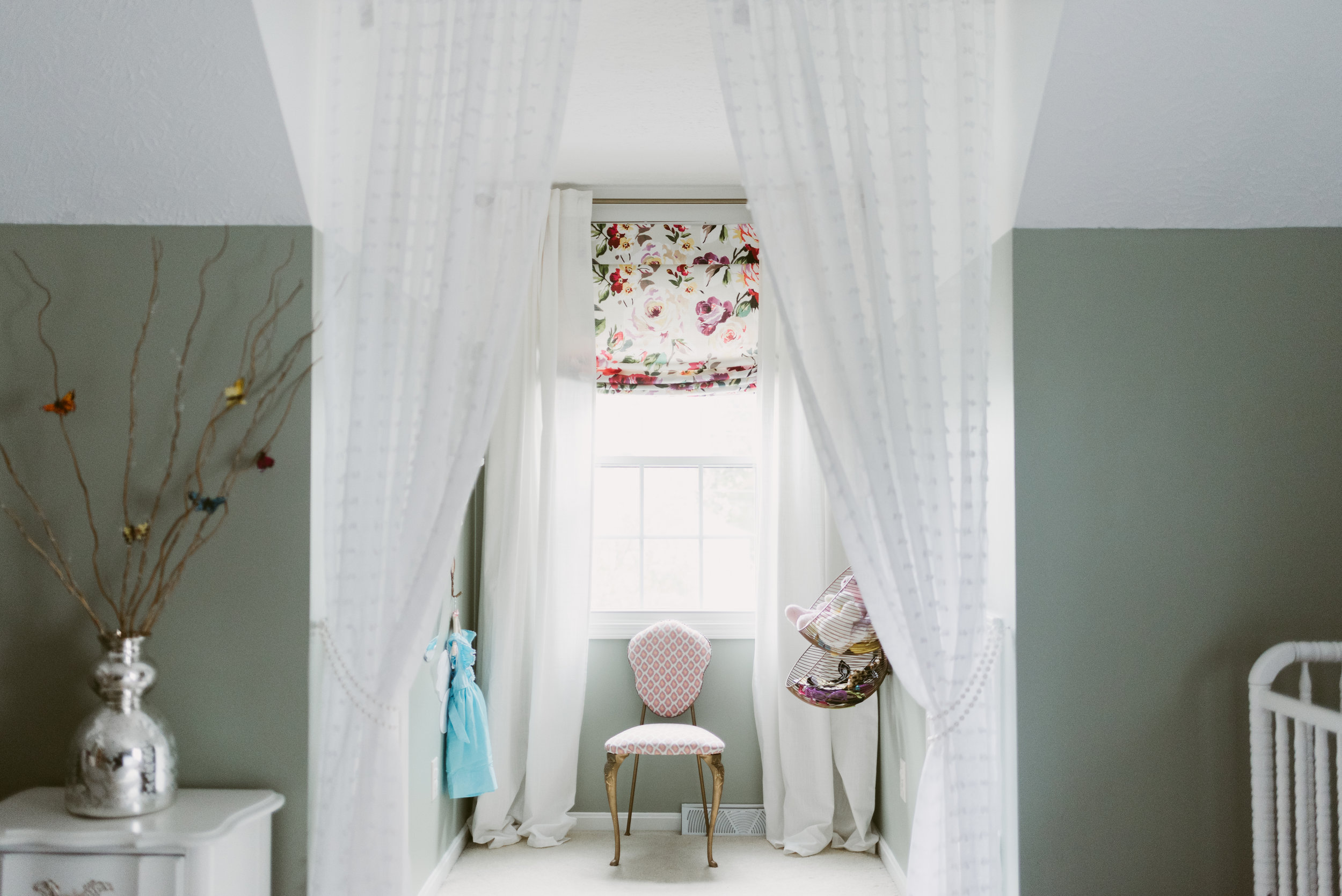
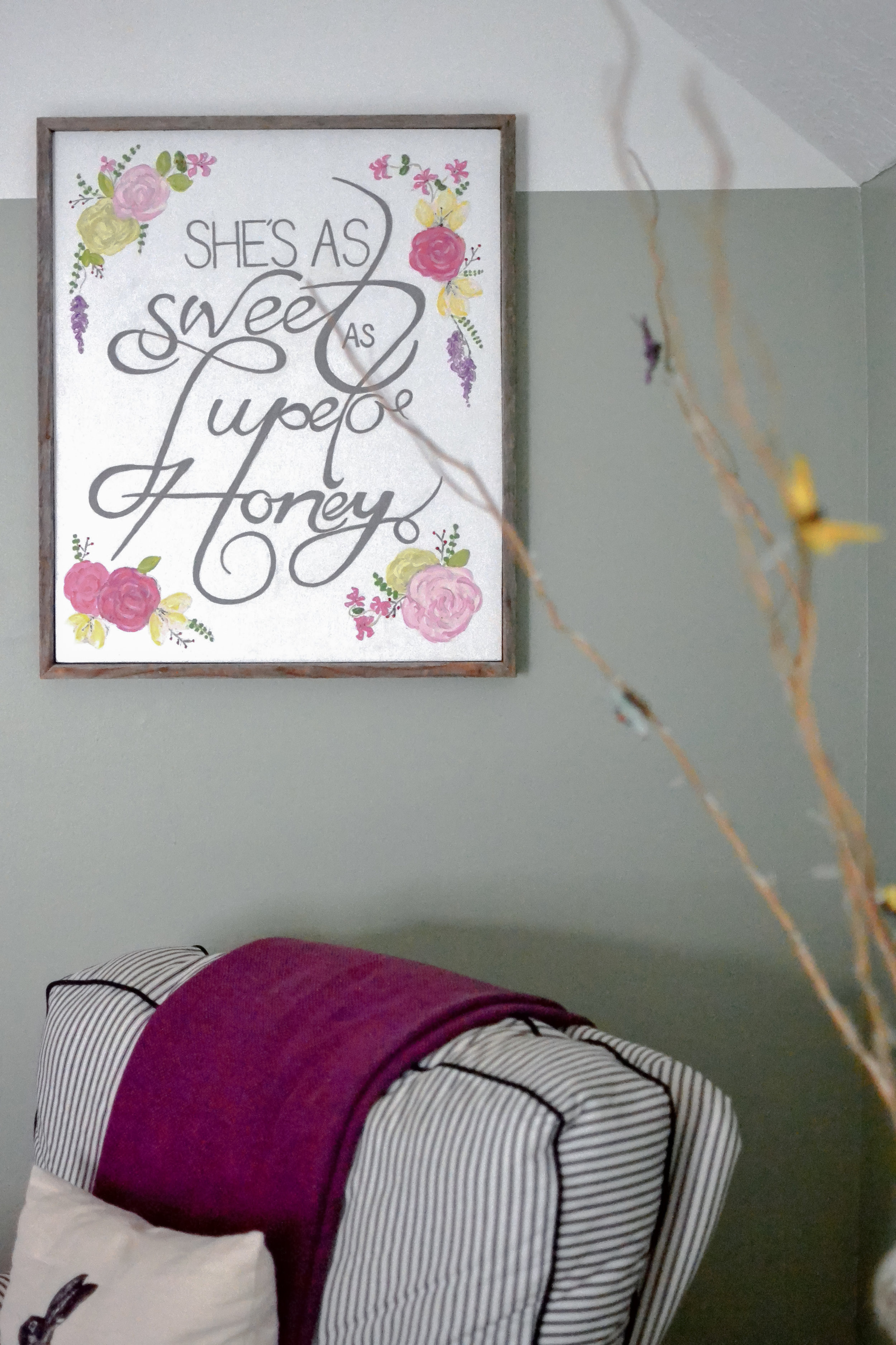
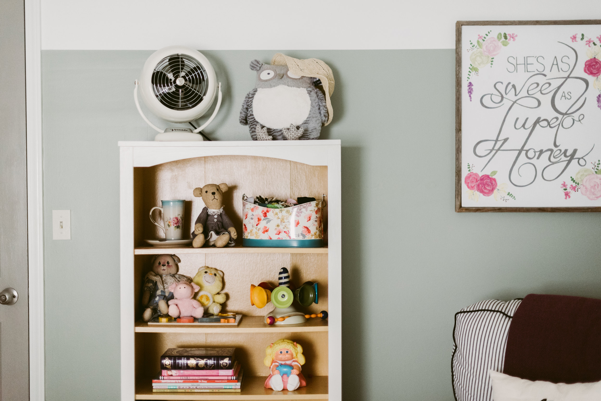
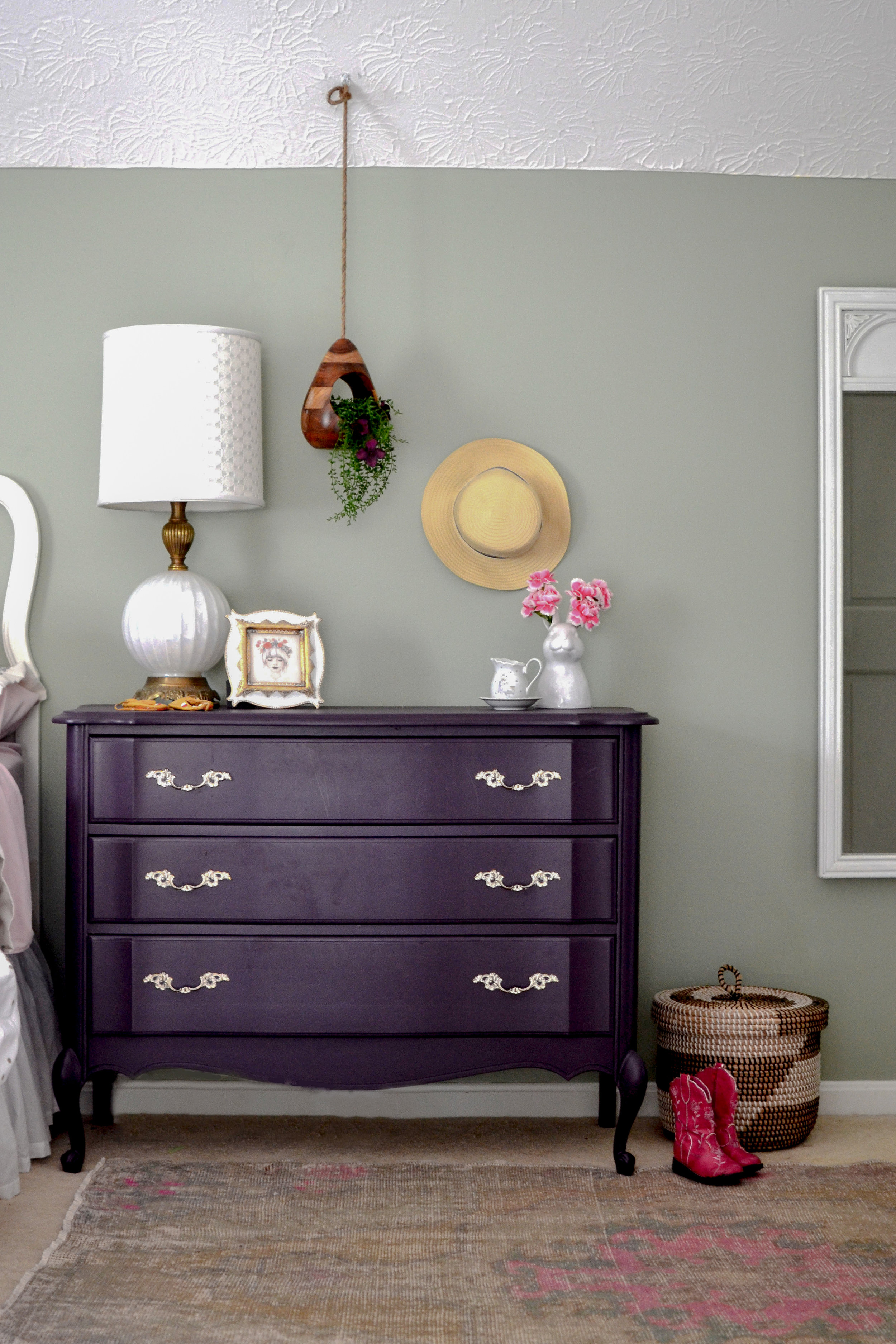
Julip's Toddler Room Inspiration
I have been scheming about the kid's rooms since we moved in. They are huge; Julip's is the biggest room in the house! We put our guest bed in there, so it has to serve as two spaces in one. That means the bedding and furniture need to coordinate in some way. 
before pic from previous owners
Her room in our old house was still pretty new and I still love the idea of make believe. There will be some new and old pieces. I'll be adding some southern charm to this new room; you know we have to represent up here. ;) I've also been working on a painting for above her crib. It's so southern and so meaningful to me...I can't wait to get it up.
Matt's making me keep the walls gender neutral since there is always a possibility that Abram could end up sharing the space with her. He says we paint too much. WHAT!? He's always my toughest client. I'm adding some "girly" colors with the accessories and things easily replaceable. I just love the way green/blue colors work with pinks.
I threw a quick inspiration board together to get the ideas on paper; hope you like!

Need help creating a home where your family can flourish? Check out our design services.
xo,
Nikki
Kitchen Progress
When we bought this house the kitchen was our biggest concern as far as storage is concerned. In fact, both of our moms were very just about freaked when they saw the amount of cabinets and counter tops. The good news is that there was plenty of space; it just wasn't being utilized.


I originally wanted to tear out the closet and pass-through window that separated the kitchen and living room, but the air ducts run through that wall. To re-route would've taken from our already small reno budget. For me, this house is all about the balance of smart updating and budgeting since we know we won't be here for more than a few years.
I drew up some plans and ordered the cabinets we needed. The closet in the kitchen was being used as a coat closet. I'm sure a coat closet is useful in the North, but there was only a VERY small cabinet pantry. I tore out the closet system and built out a pantry.
We are keeping the L-shaped cabinets, but I demo'ed the narrow wall cabinet system and installed a floor to ceiling system and an island. The wall system is slightly deeper and has space for cookie sheets, appliances, our microwave, toaster oven, and our mini-mudroom. Like I said above, I was sure we would need a place for shoes and coats by the door up here when it gets cold, so I designed drawers for shoes and a cabinet with hooks for coats and bags.
We finished the wall system just in time to hang our jackets during this week's cool front. The 6' x 3.5' island is finished and our soapstone counter tops are installed. I have to finish painting the existing doors and replacing the hardware, order and install the backsplash, and order and install lighting and this kitchen will be complete. I can see the light at the end of the tunnel and am so excited to share the kitchen with you as soon as it's finished!
xo,
Nikki
Need help creating a home where your family can flourish? Check out our design services.
Take Me To The Water
I know I know, everyone posting and talking about going back to school and the coming of fall while I'm still talking about water. I can't help it...I just love the water. Plus, living next to it in a milder climate has made me want summer to last forever. Yup, southerners, I am now one of those people. I promise to post something about pumpkins or apples soon, but for now I'm soaking up all that summer has left to offer. Growing up on the Gulf Coast Matt and I loved spending time on the water; whenever I'm stressed it is the first place I want to be to calm myself. I had been crushing heavily on Gray Malin's beach photography last spring, but with an eminent move I held off. Then, we moved to a smaller house and I read, The Life Changing Magic of Tidying Up (great read if you need to clear your house). After reading that book I knew I wanted some water/beach/boating artwork to help bring me peace and brighten my spirits at home.
I absolutely love when these prints are done on a large scale, but even smaller they can have a great impact.

Below, I've posted some of my favorite prints (high and low) to bring the water to a room near you.

1 - 2 (purchase through mini magnolia) - 3 - 4 - 5 (purchase through mini magnolia) - 6 - 7 - 8 - 9 - 10
Lifestyle Shoot | Our New Adventure
So much has been happening, with Julip turning one and all the adventures we've taken together as a family, I knew I had to find a photographer to capture our life at this stage. As soon as we got a little settled I found Aimee McNamee Photography; I love her work! Just before Julip turned one we had a photoshoot in our backyard and on the beach to document some of our favorite things these days. I just love the way they turned out. I had never done a lifestyle shoot, but getting a one and two year old to sit still is almost impossible so this was way less stress for us. Aimee made it a breeze and captured the controlled craziness of our life perfectly! Here are some (ok lots) of my favorites...it's so hard to just choose a couple. xo,
Nikki


Toddler Lake Bedroom | Storyboard
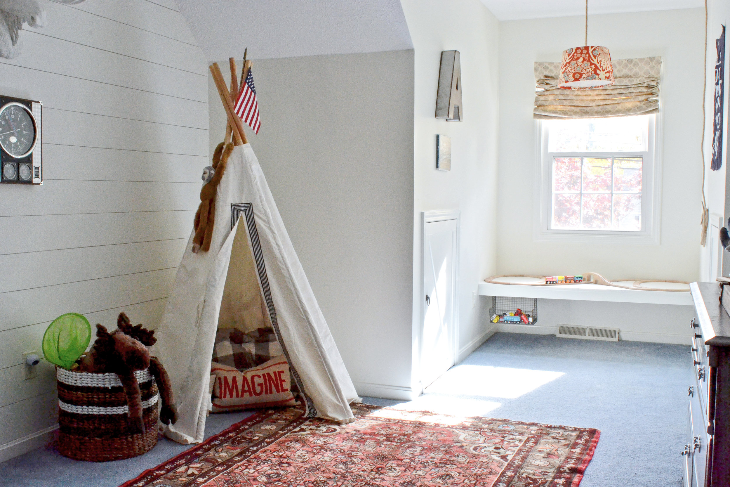
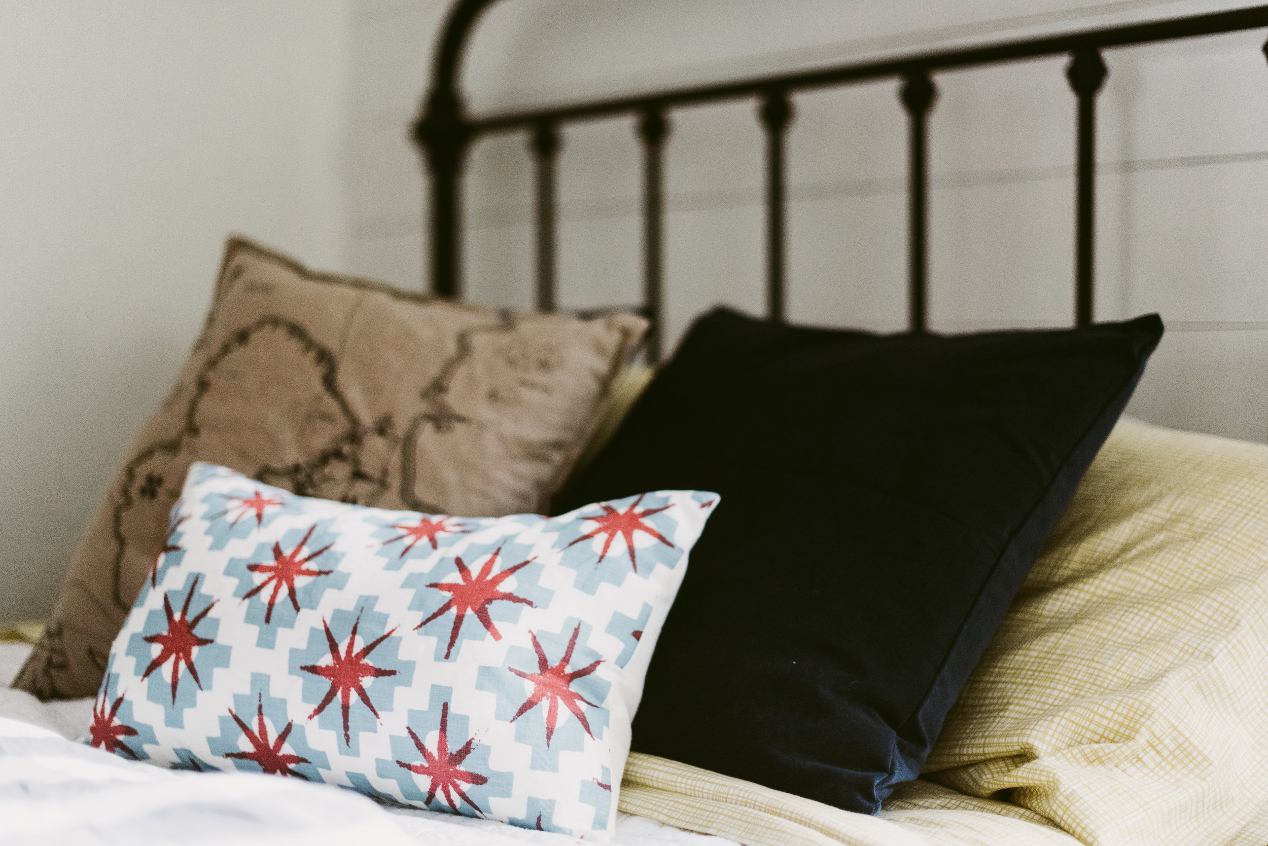
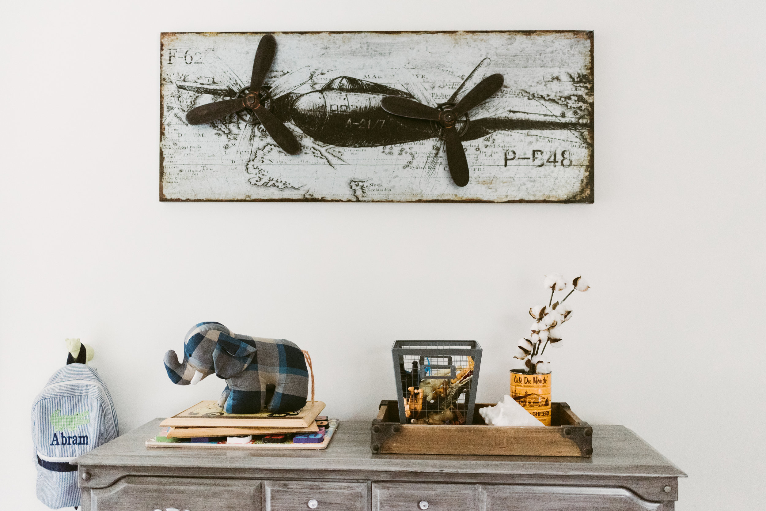
We are truckin' along on the small renovations and styling of our "lake" house. My goal was to have both kid's rooms complete, by fall, and the kitchen well under way. Well, it has been hard to get the rooms painted with little fingers everywhere, so we are making more progress on our kitchen than anything right now. First up on the blog chopping block is Abram's room. I had started transforming his room into a toddler room at our first house, and decided to go a bit further in this house. The "lake life" was a huge jumping-off point; he loves anything that moves and getting dirty outside. I am keeping the bed we bought to replace his crib, his teepee, and some of the art and decor (he still loves the planes over his bed). We are moving his shelves into Julip's room, and his dresser was always a cheap "stand-in" until we could afford a dresser that the drawers weren't falling out of.
The ceilings are only 8' so finding an appropriate light will be a challenge. I love the idea of a trunk for all of his random toys/train tracks, etc. The carpet in the room is blue...BLUE! At first I flipped out, then I decided to work with it (it was the inspiration). I have started painting the walls Benjamin Moore's White Dove to freshen everything up, and will add a mixture of pattern and color to break up the nautical vibe and keep the room toddler appropriate.
There is a dormer window in both kid's rooms. I initially thought I would add an easy window seat to both to shorten the length and give the kids a place to sit and read. Unfortunately, there are ac vents at the base trim under both windows. In Abram's room I'm now thinking about some type of floating window seat, and either a rope shelf or industrial shelf, depending on how lazy we get when it comes to building something.
xo, Nikki

Out of respect to my clients I only post some sources on the blog.
Bed | Wall Lamp | Dresser | Chandelier | Sheets
Need help creating a home where your family can flourish? Check out our design services.
Our First House | A look back
The house in Houston was our first house together. I graduated with my master's, we got married, and had two children while living in that house. I thought it would be a lot harder to leave it, but after months and months of moving delays we were ready to get the show on the road. Still, it is awesome to look back on that house and see everything we did to it with a VERY small budget.

Before: the view of the house was completely blocked with overgrown oak trees and rows of tall bushes. The shutters were aged and you couldn't even see the ones on the left side.
After: we trimmed the oak trees, moved and removed some bushes, and planted some more color and texture. We also repainted the shutters and replaced the front door with a a rod-iron style.
Before: There was one flower bed in the back yard. It was in the back corner and had two mexican palms, a row of holly bushes, and a row of box woods. The mexican palms always look like they're struggling because of the way they grow and they got tall extremely fast, making it hard to keep trimming them. The row of hedges was also hard to keep up. The holly attracted wasps like crazy in the spring and would grow so fast that it was hard to keep the "hedge" look. As soon as some parts would start to grow it would look horrible, and I would get chased by wasps when I tried to clean it up. I was so sick of that flower bed.

After: We raised the beds a bit and added texas ash and river birch trees to provide shade when they got a little bigger. I kept one holly and trimmed it to make a small tree. I planted a mixture of flowering bushes to cover the electric box (they grew in more before we moved), oleander, and other tropical plants in groupings. We also planted a small magnolia tree and added a bed with azaleas right outside of the master bedroom windows.


Before: The cabinets and floors were all the matching, stained orange oak of the 90's.
After: We repainted and antiqued the kitchen cabinets, and then added the hardware. I added trim around the stove hood to make it look a little more "finished"; it always felt like it was missing something before. We also repainted the entire downstairs because the paint was a flat white color with a pinkish hue.

 Grey Chairs | Driftwood Mirror (from TJ Maxx)-similar here
There was no light in the living room, so we added the ceiling fan with a light...it made a huge difference.

Before: the powder bath was so gaudy, and the fixtures and mirror all matched the walls.

After: I sanded all of the faux texture off and repainted. I did a stencil on the main wall you see when you walk in. I repainted the mirror and light, and changed out the faucet.

Before: the game room was a sea of beige. I not opposed to beige, but for some reason the colors used made the room feel small, dark, and the ceiling felt very low.


After: Repainting the walls with white at the top really opened up the room. The ceilings instantly felt taller. We also replaced the carpet and added a dividing shelf to change up the space plan a bit and make the room more functional.

Before: This was our junk room. It was where stuff collected and no one was allowed inside.


After: Abram's nursery and big boy room. New paint, lighting, carpet, and curtains to make the window feel larger.

Before: Spare bedroom (photo taken after I started unloading the shelf). It wasn't bad, but wasn't great.


After: It felt much bigger with a lighter color, and was a fun nursery for Julip. We repainted, got new carpet, and a new fan.


Both of the main bathrooms started out a pink-white with un-framed builder mirrors and the long, shiny brass vanity lighting of the 90's. I can't find the before pics I took.
After: I painted the walls and changed out the light fixtures and sink faucets. We also added the mirror frames using a combination of tutorials. In the kids bathroom I took off the towel rod that was hanging off the wall, and installed towel hooks from World Market. It was much more useful when we had multiple guests coming for the weekends.


The master bedroom was dark before (again, missing the picture), so my main goal was to brighten it up with paint and new carpet.
This house will always hold special memories as a place where our family grew. It is also proof of what can be done with a small, starter/student budget. I little bit can make a big impact. The current owners are continuing the upgrades, and I love it all. That house is so perfect for a family! I'm currently transforming our "lake" house and can't wait to take you along for the ride.
xo,
Nikki
Thoughts on 30
I turned 30, on Wednesday. I had thought about that day since I turned 21 (the last big milestone birthday). Life is not what I thought it would be at this age. I am no where near where I thought I would be, yet I have everything I wanted. Last year when I was pregnant, swollen, and hot during my birthday I planned on a festive party for the big 3-0 where I could rock a cute outfit with the same body I had post baby #1. It would be a joint party for Matt and I since I was even more pregnant, swollen, and hot for his 3oth last year. We would have all of our friends and family over, make drinks, and let the kids run around chasing each other.
Well, there I actually was sitting in my living room with one kid sleeping in my bed and the other sleeping on the living room floor in his post tornado destruction. You see a painter showed up to give me a hand on some projects that I just couldn't finish on my own. He was planned, but the day wasn't scheduled and he showed up that morning while we were in our pj's. I spent the morning moving all of our furniture around for him. He took over the kid's rooms and I battled with no-nap kids all day because they couldn't sleep in their rooms. Mickey was on and I was too scared to turn it off for fear of waking one of them.
My outfit consisted of a t-shirt, jeans, tennis shoes, and a necklace because I just had to "try" a little on my birthday. I was lucky to even look this decent with the battle I had fought. Almost two months after our move, and our house still looked like a clothes bomb went off because of lack of storage/too much stuff, and there were partially done projects going on in several rooms to add said storage and update the house. I did my makeup in a mirror on the living room floor because the previous owners took all the mirrors and I haven't found/ hung the replacements yet. While I did my makeup Julip was alternating between hanging on me crying and laughing at herself as she tried to eat the mirror. Abram was alternating between total house destruction, at lightening speed, and continuing with his plot to try and choke me out before I hit 31. My day old hair...well it was there and managed to get brushed.


Then I remembered what my Mimi told me. "Take a picture, you'll look back and laugh". So I did; I set up my camera right there and snapped a few. You see my house may be post apocalyptic at the moment, but the weather is great and our new community is awesome...plus, I'm creative and I've got plans for this house. We may not have a big party with lots of friends because we are across the country, but I was busy answering calls all day. My weight might not be ideal and my hair and makeup are rough, but it's because I've had kids in and on me for the past 3 years. This blog may seem slow, but it's because I have lots of projects in the background that are on their way. And I may have been sitting alone in my living room, but my husband was on his way home with gluten-free sushi (a hard find), a paddle board gift, and plans for a night at the fair with our kids. This is my season of life right now and I'm trying my hardest to embrace it. If you find yourself at our house, it may seem like we are a giant mess, but there's a lot of love here...and a cold drink if you need one.
xo,
Nikki
My Son's Leash Arrived Today

As you can tell by my title the struggle is real over here. I have all of these topics jotted down to write about, but have been feeling like I just can't wrap my head around them. Then, Abram's leash arrived and it hit me, this is my life right now. So here I am to try and lift the stigma of putting your kid on a leash; something I swore I would never do.
I have always told Matt that I think Abram is our dog, Lucky, reincarnated. Lucky was funny, smart, a people person, adventurous, and spun around like crazy. Lucky also bolted a lot. In fact, the last time he did it he was hit by a car and killed, right before I got pregnant with Abram. I am not saying my son is a dog, but with the leash I think the transition is complete ;).
Seriously though, Abram is an extremely smart little boy with a lot of energy. Unfortunately, smart for a 2.5 year old means exploring everything and testing his limits. He is also very stubborn (he obviously gets that from his dad's side). He hates riding in the cart unless it looks like a car, and usually walks next to me. Occasionally, he will get a spurt of energy and take off running. This just started with the move and I know it's a phase, but it is a dangerous one.
The first time it happened I was in a huge store with both kids and the item I was trying to get off the shelf was stuck. In the time it took for me to get the item he was gone. I ran through the store, pushing Julip in the cart, with my heart racing. I was screaming his name, but he was no where to be found. Finally, at the opposite end of the store a group of women had him surrounded. I almost cried with gratitude for these women as I laughed it off on the outside and thanked them. I started thinking about the leash that evening, but wrote it off as a one-time thing.
Then another series of bolts happened, leaving Matt chasing him across the store. One time he almost ran out of the automatic doors. He thinks it's a game of chase and we try not to "chase" him, but cannot let him out of our sight. People tell me to explain to him why he can't run. Why didn't I think of that!? Have you ever tried explaining ANYTHING to a 2 year old? So this week I gave in and ordered the leash with the best reviews.
Now, here I sit trying to get up the courage to use it in public. I know how it will look, but in my heart I just want him to be able to explore while knowing he is safe. Even if it means being "that" parent for a couple months.
xo,
Nikki